Preview image. Unlock full-res
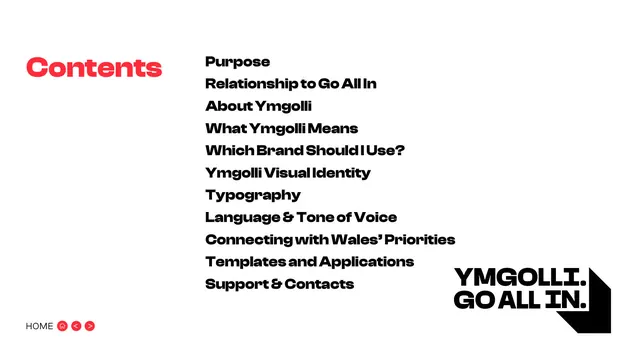
White contents page listing eleven sections in bold black type beside a red Contents heading and the chevron-shadow wordmark.
Summary
The contents page: a red "Contents" label on the left and a single column of eleven bold black section titles on the right, with the chevron-shadow wordmark tucked into the lower-right corner.
Visual description
White background. Top-left, "Contents" set large in the bold brand sans, coloured the signature red. To its right, a stacked list of eleven section names in heavy black sans, tightly leaded: Purpose, Relationship to Go All In, About Ymgolli, What Ymgolli Means, Which Brand Should I Use?, Ymgolli Visual Identity, Typography, Language and Tone of Voice, Connecting with Wales' Priorities, Templates and Applications, Support and Contacts. Lower-right corner carries a small "YMGOLLI. GO ALL IN." lockup with its chevron shadow. Bottom-left shows the "HOME" label with three small red circular nav pills (home, back, forward).
Key takeaway
Colouring only the "Contents" label in the brand red while keeping the actual list pure black is a quiet way to inject brand colour without harming legibility. The corner lockup reinforces identity on an otherwise utilitarian page.
Reuse notes
A reusable contents layout for any longer guideline or report: one accent-coloured label, a dense black list, brand mark in the corner. The heavy weight reads as confident but watch line spacing if the list grows beyond a dozen items.
From this deck: Contents
View deck





More like this

Keep what you find
A free account saves references to boards and can send you a weekly email of picks based on what you save.
To see every result, go Pro.