Preview image. Unlock full-res
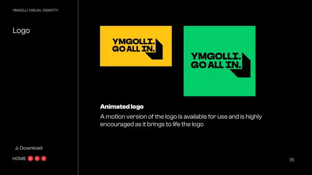
Black page presenting the motion version of the logo as two coloured stills (yellow and green) with a short note encouraging its use.
Summary
The motion page: the animated logo shown as two stills on bright yellow and green blocks, with a note that a motion version exists and is encouraged.
Visual description
Black background, "YMGOLLI VISUAL IDENTITY" eyebrow and "Logo" title in the left sidebar. The main area shows two frames of the logo as colour stills: a yellow landscape block with the black "YMGOLLI. GO ALL IN." lockup, and a green square block with the same lockup, both carrying the chevron shadow, suggesting frames from an animation. A subhead "Animated logo" sits below with a short paragraph saying a motion version of the logo is available and highly encouraged as it brings the logo to life. A "Download" link sits above the "HOME" nav bottom-left; page "15" bottom-right.
Key takeaway
Representing a motion asset as a couple of bright colour-block stills is an honest way to show animation in a static document. The encouragement to prefer the animated mark signals a modern, digital-first brand.
Reuse notes
Reuse where a brand ships a motion logo but the guideline is a PDF; show key frames plus a download. The colour-block frames double as a reminder that the mark sits on the full palette.
From this deck: Animated logo
View deck
More like this


Keep what you find
A free account saves references to boards and can send you a weekly email of picks based on what you save.
To see every result, go Pro.