Preview image. Unlock full-res
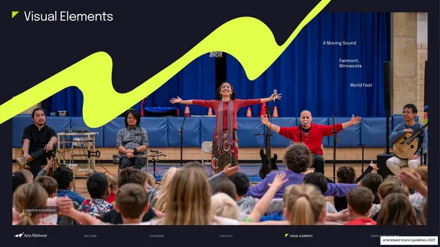
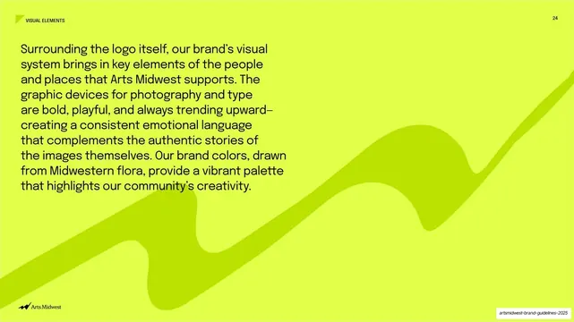
A full-bleed lime-green slide with a navy paragraph introducing the visual system and a large tone-on-tone accent wave embossed across the lower field.
Summary
An intro slide for the Visual Elements section: a saturated lime-green full bleed carrying a block of navy sans-serif body copy, with the brand's signature accent wave rendered tone-on-tone across the lower half.
Visual description
Edge-to-edge lime-green (#D4F500) field. A small "VISUAL ELEMENTS" label with a corner flag sits top-left and a page number "24" top-right. The upper-left holds a large multi-line paragraph in dark navy sans-serif, set big and confident, describing how the visual system brings in the people and places Arts Midwest supports and noting the brand colors drawn from Midwestern flora. Filling the lower two-thirds, the brand's flowing zigzag accent graphic is rendered in a slightly darker olive-green, tone-on-tone, sweeping diagonally upward to the right so it reads as a subtle embossed texture rather than a hard shape. The Arts Midwest logo runs bottom-left in black.
Key takeaway
Rendering the signature accent graphic tone-on-tone (one step darker than the background) so it becomes a large quiet texture instead of competing with the copy. Pairing a single bold color field with oversized body type makes a section intro feel like a statement, not a caption.
Reuse notes
A confident intro/transition pattern for brands with a vivid signature color and a hero graphic. The tone-on-tone accent works in any brand color; setting the intro paragraph oversized keeps a copy-only slide from feeling empty. Best when the color is saturated enough to carry dark text legibly.
From this deck: Visual Elements intro, lime field with tonal accent
View deck