Preview image. Unlock full-res
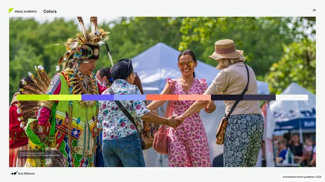
Light slide previewing the palette as a horizontal swatch bar laid across the middle of a full-bleed photo of people dancing at an outdoor pow wow.
Summary
The opener for the color section: a full-bleed photograph of people joining hands at an outdoor pow wow, with the brand's full palette laid as a single horizontal swatch bar straight across the middle of the image.
Visual description
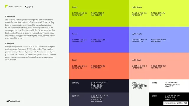
Pale off-white frame with a small "VISUAL ELEMENTS" label, a "Colors" title, and page number "25" along the top. A wide full-bleed photograph fills most of the slide: a man in regalia and several attendees smiling and clasping hands at a sunny outdoor festival, white tents behind. Cutting horizontally across the vertical center of the photo is a continuous band of solid color blocks previewing the palette: lime green, light green, periodic violet/purple, coral, light coral, a run of dark navy and sky tones, ending in white. A small photo credit sits lower-left on the image and the Arts Midwest logo runs bottom-left.
Key takeaway
Previewing the entire palette as one uninterrupted horizontal swatch bar slicing through a real community photo, so color and context are introduced in a single frame before the detailed spec page. The band sitting on the photo ties the palette to the people it represents.
Reuse notes
A vivid way to open a color section, especially for brands whose palette is tied to a place or community. The swatch-bar-over-photo device transfers to any palette; pick a photo with a calm horizontal midband so the swatches stay readable. Pairs directly with a following full-spec palette page.
From this deck: Colors intro, photo with horizontal swatch bar
View deck







More like this




Keep what you find
A free account saves references to boards and can send you a weekly email of picks based on what you save.
To see every result, go Pro.