Preview image. Unlock full-res
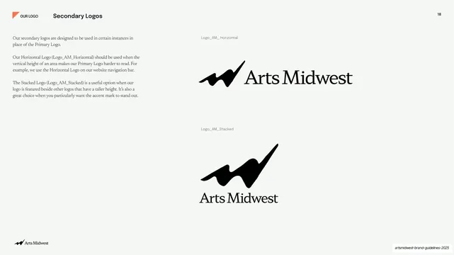
Near-white slide showing the horizontal and stacked secondary logo lock-ups on the right with usage notes for each at left.
Summary
The secondary logo lock-ups: the horizontal and stacked Arts Midwest variants shown on near-white, each with a note on when to use it.
Visual description
Warm off-white (#F4F3EE) ground with generous whitespace. "Secondary Logos" runs top-left after the "OUR LOGO" tab, "18" top-right. The left column gives three short serif paragraphs explaining the secondary logos and when to choose the horizontal versus stacked variant. The right two-thirds stacks two lock-ups: the horizontal logo (swoosh mark left, "Arts Midwest" serif wordmark right) labeled "Logo_AM_Horizontal", and below it the stacked logo (swoosh mark above the centered wordmark) labeled "Logo_AM_Stacked", both in black with small grey asset names.
Key takeaway
Showing the alternate lock-ups at real proportions, each with its own filename and a one-line "use this when" rule, so the choice between variants is unambiguous. The consistent whitespace and black-on-cream treatment keep all the logo pages a matched set.
Reuse notes
A reusable logo-variants page for brand guidelines that ship more than one lock-up. Pair the visual with a concrete usage rule per variant (height-constrained spaces, alongside other logos). Keep it photo-free like the rest of the logo section.
From this deck: Secondary Logos horizontal and stacked
View deck




More like this








Keep what you find
A free account saves references to boards and can send you a weekly email of picks based on what you save.
To see every result, go Pro.