Preview image. Unlock full-res
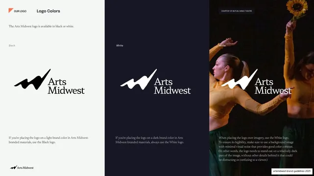
Three-panel slide showing the logo in black on light, white on dark navy, and white over a dance photograph, with guidance on choosing each.
Summary
A three-column slide demonstrating the logo's two color variants: black on a light field, white on dark navy, and white placed over a dance photograph, each panel captioned with when to use it.
Visual description
The slide splits into three full-height vertical panels. Left panel: pale off-white background with a running header ("OUR LOGO" plus coral flag, bold "Logo Colors" title), a short serif intro, the small label "Black", the black Arts Midwest logo centered, and a serif caption at the bottom on placing the logo on light brand colors. Center panel: dark navy field labeled "White" with the white reversed logo and matching bottom caption for dark backgrounds. Right panel: a full-bleed photograph of two dancers in amber costumes, one reaching up holding a sunflower, with the white logo overlaid mid-panel, the label "White", a small "COURTESY OF MUTUAL DANCE THEATRE" tag, page number "21", and a longer caption on placing the logo over imagery with good contrast.
Key takeaway
Showing all three contexts (light, dark, photo) side by side as equal vertical panels, so the contrast rules are demonstrated rather than just described. The photo panel proves the over-image case in the same glance, picking a quiet, dark area of the image for the mark.
Reuse notes
A compact way to cover logo color variants and over-image placement on a single slide. The three-panel split reads cleanly in any identity manual; the photo panel needs an image with a calm, low-noise region for the logo to sit on.
From this deck: Logo colors, black and white usage
View deck

















More like this








Keep what you find
A free account saves references to boards and can send you a weekly email of picks based on what you save.
To see every result, go Pro.