Preview image. Unlock full-res
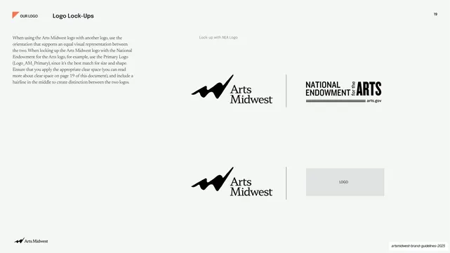
Light reference slide showing the Arts Midwest logo co-locked beside a partner mark across a thin vertical divider, with body copy on the left.
Summary
A logo-usage reference slide on a pale background showing how the Arts Midwest logo locks up next to a co-brand partner mark, separated by a thin vertical hairline.
Visual description
Pale off-white field. A small all-caps utility label "OUR LOGO" with a tiny coral flag icon sits top-left, beside a bold sans section title "Logo Lock-Ups"; a page number "19" sits top-right. The left column holds a block of serif body copy explaining co-locking with another logo and clear-space rules. The right two-thirds shows two stacked lock-up examples: each pairs the black Arts Midwest logo (swooping accent mark plus serif "Arts Midwest" wordmark) on the left with a partner mark on the right, divided by a thin full-height vertical rule. The top example partners with the National Endowment for the Arts mark; the lower one shows a light gray placeholder rectangle labeled "LOGO". A small caption "Lock-up with NEA Logo" sits above. A running footer carries the Arts Midwest logo bottom-left.
Key takeaway
The single thin vertical hairline doing all the work of separating two co-branded logos at equal visual weight. Pairing a real example (NEA) with a gray "LOGO" placeholder makes the rule reusable for any future partner without redrawing the slide.
Reuse notes
A clean template for the co-branding page of any identity system, especially nonprofits and grant-funded organizations that constantly lock up with partner and funder marks. The equal-weight divider approach scales to any two marks; swap the placeholder box for the real partner logo.
From this deck: Logo lock-ups with partner marks
View deck







More like this






Keep what you find
A free account saves references to boards and can send you a weekly email of picks based on what you save.
To see every result, go Pro.