Preview image. Unlock full-res
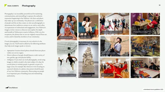
A light page pairing a column of photography-direction copy with a multi-row grid of captioned community photographs.
Summary
The photography-direction page: a left column of guidance copy beside a dense, captioned grid of authentic community and performance photographs that demonstrate the desired look.
Visual description
White page, "VISUAL ELEMENTS / Photography" header at top left with the small lime angle mark and a slide number 34 top right. The left third holds two blocks of small serif body copy, the second a bulleted list ("Appropriate," "Diverse," "Ambiguous") on art-directing and selecting images. The right two-thirds is a grid of roughly ten photographs in two main rows of varied tile sizes: smiling portraits, a dance class, gallery sculpture, performers, and craft displays, each carrying a tiny uppercase credit caption ("COURTESY OF...," "AZURE BAHAMHANI COURTESY OF..."). The imagery is warm, candid, and people-centered. The Arts Midwest logo sits bottom-left.
Key takeaway
Showing rather than telling: a wall of real, credited photographs does more to define a brand's image standard than a paragraph could, and the per-photo credit line models the captioning practice at the same time. Pairing terse principle words (Appropriate, Diverse, Ambiguous) with the grid keeps the rules scannable.
Reuse notes
A practical layout for the photography section of any brand guide, especially mission-driven, community, or arts organizations that depend on authentic imagery. The split of guidance-copy-left and mosaic-grid-right is directly reusable. Its credibility rests entirely on the quality and diversity of the sample photos.
From this deck: Photography principles and grid
View deck







More like this






Keep what you find
A free account saves references to boards and can send you a weekly email of picks based on what you save.
To see every result, go Pro.