Preview image. Unlock full-res
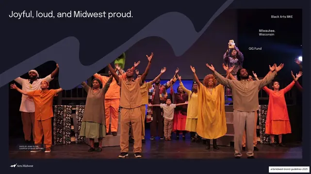
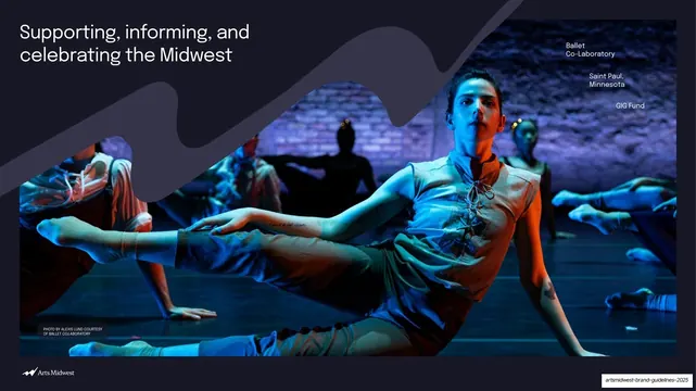
A light page explaining the playful dynamic caption treatment, demonstrated with two photos carrying free-form grouped overlay text.
Summary
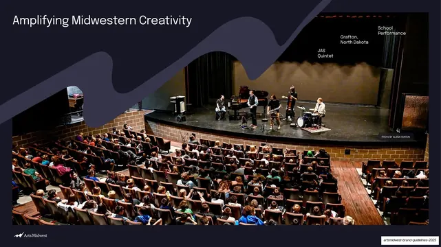
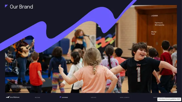
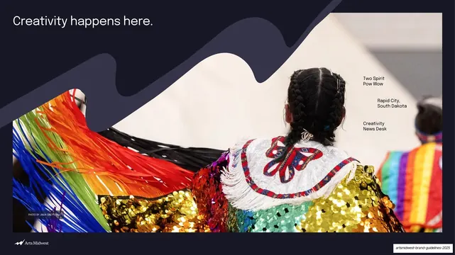
A typographic guidance page for the brand's "dynamic" caption treatment: free-form white or black text scattered in groups over a photo to name the artist, event, location, and art form.
Visual description
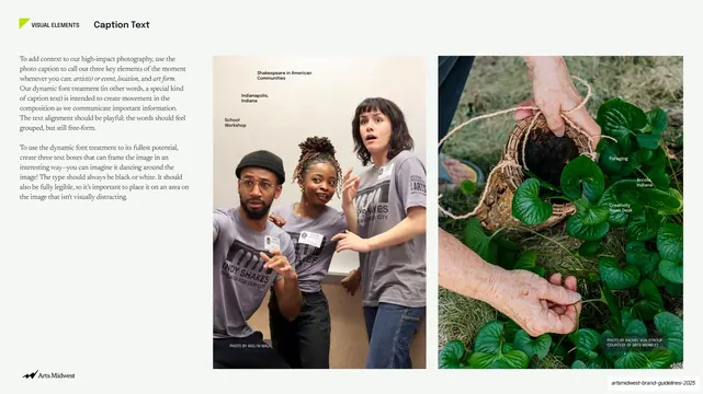
White page, "VISUAL ELEMENTS / Caption Text" header at top left with the small lime angle mark. The left third carries two paragraphs of serif body copy describing a playful, free-form-but-grouped caption treatment and the rule that type stays black or white and fully legible. The right two-thirds shows two tall photos side by side. Left: three young performers reacting, overlaid with small black caption fragments ("Shakespeare in American Communities," "Indianapolis, Indiana," "School Workshop") staggered across the upper area. Right: hands holding a foraged plant nest over greenery, with white caption fragments ("Foraging," "Arcola, Indiana," "Creativity News Desk") placed in the negative space. Both carry tiny photo credits at the lower edge and demonstrate text "dancing" around the subject. The Arts Midwest logo sits bottom-left.
Key takeaway
Treating captions as a movement-making typographic element rather than a static line: breaking the metadata into grouped fragments and scattering them into the photo's quiet areas gives an editorial, energetic feel while staying readable. The black-or-white-only rule keeps it disciplined.
Reuse notes
A reusable idea for arts, editorial, and storytelling brands that want photo captions to feel alive instead of utilitarian. Works only when there is genuine negative space in the image to host the text, and when someone places each fragment by eye. Less suited to dense layouts or templated systems.
From this deck: Caption Text dynamic treatment
View deck