Preview image. Unlock full-res
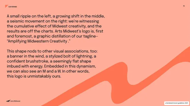
Full coral slide explaining the logo concept as a ripple, banner, and bolt in two grotesque paragraphs, with a tonal wave climbing the lower right.
Summary
A full coral statement slide explaining the logo's concept (a ripple, a banner, a lightning bolt, an embedded M and W) in two large grotesque paragraphs.
Visual description
The whole slide is a light coral (#FF8A6B) field. Two paragraphs of near-black grotesque copy fill the upper-left: the first ties the logo to the tagline ("a graphic distillation of our tagline-'Amplifying Midwestern Creativity.'"), the second lists its visual associations ("a banner in the wind, a stylized bolt of lightning, a confident brushstroke... we can also see an M and a W"). A darker coral (#FF6B4A) wavy ribbon, the amplify device, rises across the lower-right as a tonal graphic. The "OUR BRAND" tab sits top-left, "16" top-right, the Arts Midwest mark bottom-left.
Key takeaway
Flooding the slide in the section accent and explaining the logo's meaning in the brand's own confident voice, with the ribbon shape recurring as a watermark. Articulating "what the mark can be read as" is a smart way to make an abstract logo feel intentional.
Reuse notes
A reusable logo-rationale page: one saturated color field, the concept stated plainly, the mark itself shown tonally. Pairs naturally with the logo presentation slides that follow. Keep the copy tight to hold the large type.
From this deck: Logo concept statement on coral
View deck