Preview image. Unlock full-res
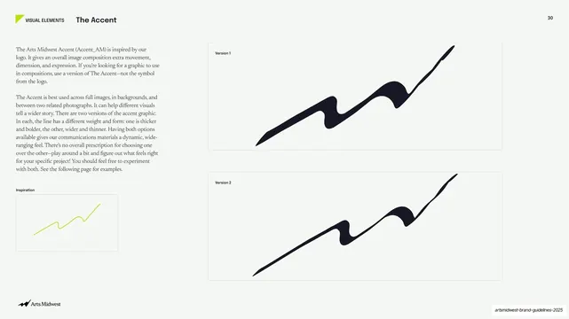
Light slide defining the brand's signature accent graphic, with a serif rationale, a small lime inspiration sketch, and two boxed black versions of the wave.
Summary
The definition page for the brand's signature accent graphic: a serif rationale and a small lime inspiration sketch on the left, with two boxed black versions of the swooping wave (one thicker, one thinner) stacked on the right.
Visual description
Pale off-white background with the running header ("VISUAL ELEMENTS", bold "The Accent", page number "30"). The left column holds two serif paragraphs explaining that the Accent (Accent_AM) derives from the logo and adds movement, plus how and where to use it, and at the bottom a small bordered "Inspiration" box containing a thin hand-drawn lime-green zigzag line. The right two-thirds shows two large bordered boxes stacked vertically: "Version 1" with a bolder, thicker black wave and "Version 2" with a wider, thinner black wave, both sweeping diagonally upward to the right. The Arts Midwest logo runs bottom-left.
Key takeaway
Formally defining a signature graphic as a named asset with two sanctioned weight variants, shown large in clean boxes, and tracing it back to a simple inspiration sketch. Offering two versions (thick vs thin) gives flexibility while keeping the device controlled.
Reuse notes
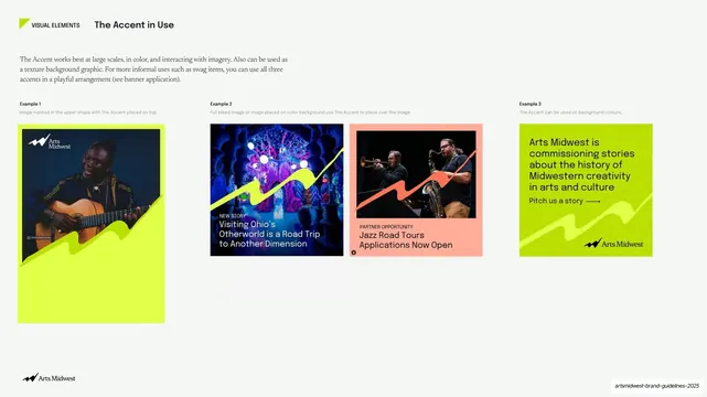
A model for documenting any proprietary brand graphic or motif in a guideline. The named-asset, two-version, plus inspiration-sketch structure transfers to any signature shape. Pairs with a following "in use" page showing the device applied to real layouts.
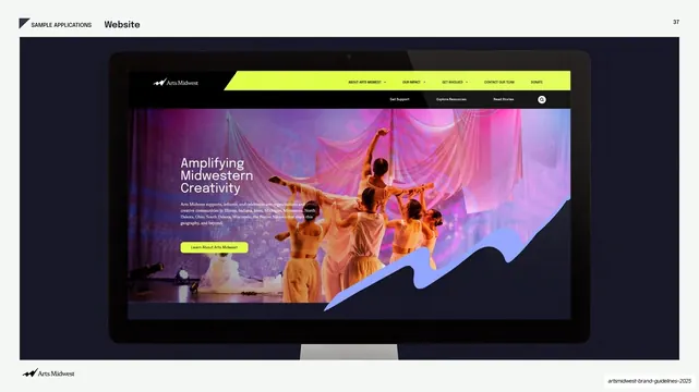
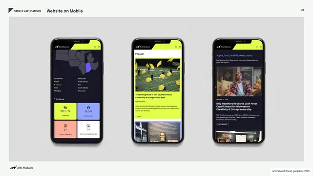
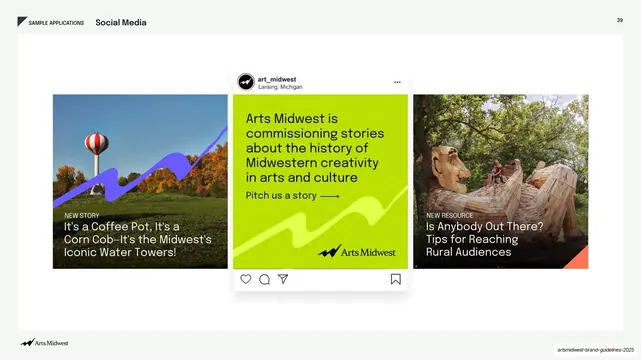
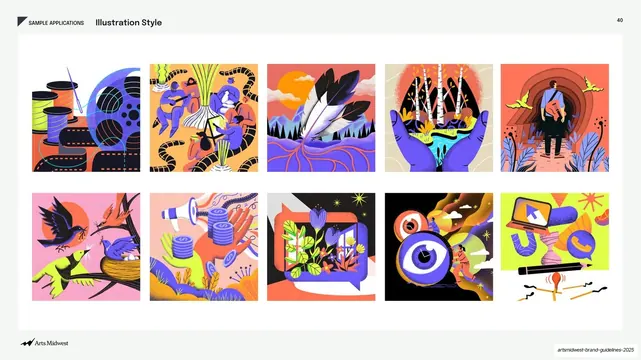
From this deck: The Accent, two versions of the signature graphic
View deck




More like this





Keep what you find
A free account saves references to boards and can send you a weekly email of picks based on what you save.
To see every result, go Pro.