Preview image. Unlock full-res
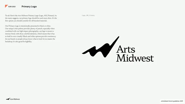
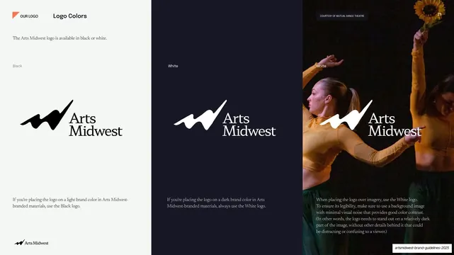
Near-white slide presenting the black Arts Midwest primary logo large at right with usage rationale copy in two serif paragraphs at left.
Summary
The primary logo presentation: the black Arts Midwest swoosh-and-serif-wordmark shown large on near-white, with rationale copy at left.
Visual description
Warm off-white (#F4F3EE) ground with generous whitespace. "Primary Logo" runs top-left after the "OUR LOGO" tab, "17" top-right (faint). The left column holds two short serif paragraphs ("Ta-da! Here's the Arts Midwest Primary Logo (Logo_AM_Primary)...") explaining when to use it and why it is shown in black or white. The lower-right two-thirds presents the full logo large: a black brushy swoosh mark (the abstracted M/W) above and left of the stacked "Arts Midwest" serif wordmark. A small grey asset name, "Logo_AM_Primary", labels it.
Key takeaway
The calm, near-empty logo-presentation page: lots of whitespace, the mark shown big and uncrowded, a literal asset filename so designers know exactly which file this is. The light, photo-free break resets the eye after the saturated concept slide.
Reuse notes
A reusable primary-logo display page for any brand guideline. The asset-name label (e.g. Logo_AM_Primary) is a small, high-value detail to copy. Give the mark room; resist adding decoration on logo pages.
From this deck: Primary Logo presentation slide
View deck










More like this








Keep what you find
A free account saves references to boards and can send you a weekly email of picks based on what you save.
To see every result, go Pro.