Preview image. Unlock full-res
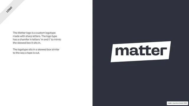
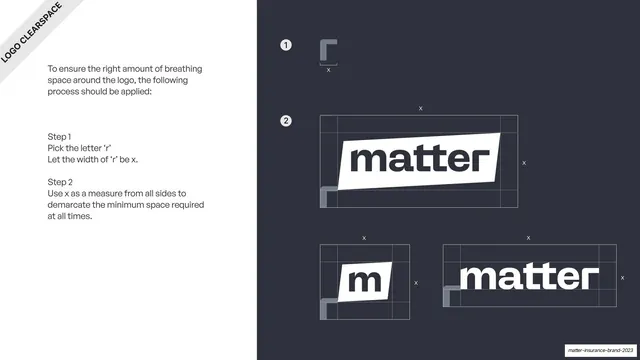
Split slide explaining the custom skewed-box logotype, with body copy left and the white "matter" tape lockup on a slate panel right.
Summary
The logotype rationale: left-hand body copy explains the custom sharp-cornered wordmark and its skewed "tape" box, while the right half shows the white logo lockup large on a dark slate panel.
Visual description
A split slide. The left two-thirds is white with a rotated "LOGO" ribbon in the top-left corner and two short General Sans paragraphs explaining that the logotype is custom, with a chamfer on the "m" and "t" to mimic the skewed box it sits in, and that the box reads like a cut piece of tape. The right third is a solid slate-grey (#2F323A) panel carrying the primary logo: the lowercase "matter" wordmark in dark grey inside a white skewed parallelogram, tilted slightly off-horizontal.
Key takeaway
Explaining the logo's geometry in two plain sentences while letting the lockup occupy a full color panel, so the rationale and the proof sit side by side. The chamfered letters tying the wordmark to its tape container is the smart detail.
Reuse notes
A clean template for the "our logotype" page of any brand guideline: rationale text on one side, hero lockup on a contrasting panel on the other. Reusable layout regardless of the mark. The tape/skewed-box concept is specific to Matter.
From this deck: Custom logotype explanation
View deck







More like this








Keep what you find
A free account saves references to boards and can send you a weekly email of picks based on what you save.
To see every result, go Pro.