Preview image. Unlock full-res
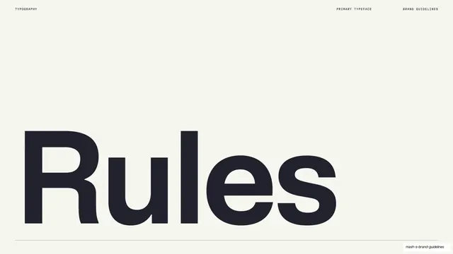
A light slide with the single word "Rules" set enormous in the primary typeface, sitting on a hairline rule.
Summary
The primary-typeface name slide: the word "Rules" (the typeface's name) set very large in dark sans-serif across the lower half, anchored on a thin rule.
Visual description
Warm off-white ground, almost entirely empty. A single oversized dark word, "Rules", fills the lower-left and center, set in a clean neo-grotesque sans with the characters bleeding toward the edge. A thin hairline rule runs full width just beneath it. A small monospace header reads "TYPOGRAPHY" left, "PRIMARY TYPEFACE" and "BRAND GUIDELINES" right. The vast top whitespace gives the wordmark all the weight.
Key takeaway
Introducing a typeface by setting its own name at display scale, so the specimen opens with the type doing the talking. The lone hairline rule and acres of whitespace let one word carry the entire frame.
Reuse notes
A confident opener for the primary-type chapter of a manual, or any specimen page. Depends on the typeface looking good very large; pairs with the detailed specimen and weight pages that follow.
From this deck: Mash Rules primary typeface title
View deck












































More like this








Keep what you find
A free account saves references to boards and can send you a weekly email of picks based on what you save.
To see every result, go Pro.