Preview image. Unlock full-res
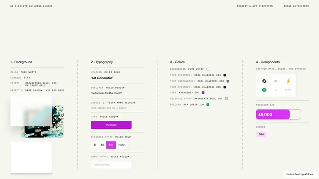
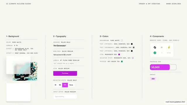
Light four-column UI build spec breaking a snippet into Background, Typography, Colors, and Components rules with live samples.
Summary
A four-column anatomy of a Mash UI snippet on cream, breaking it into Background, Typography, Colors, and Components, each column listing the exact specs beside a small live sample.
Visual description
Cream full-bleed slide. Mono "UI ELEMENTS BUILDING BLOCKS" top left, "IMAGERY & ART DIRECTION / BRAND GUIDELINES" top right. Four numbered columns separated by dotted vertical rules sit in the lower two-thirds. "1 - Background": pure white, 8px corners, blur and drop-shadow specs, with a blurred image-card sample. "2 - Typography": labeled rows for headers (Rules Bold), sublines, labels (GT Flexa Mono), and CTAs, each with a styled example, a magenta "Purchase" button, a selected $1/$5/$15 toggle, and a "Type anything" input. "3 - Colors": a swatch list with names and chips (Pure White, Cool Charcoal 800/600, Mashgenta 600, Key Green 700). "4 - Components": a small icon-and-symbol card, a magenta progress bar showing "$5,000", and an amount chip. All set in the same neo-grotesque with mono labels.
Key takeaway
Deconstructing a single UI snippet into four labeled build layers, each pairing a spec list with a working sample. It reads like design tokens made visible: background, type, color, components, all on one page.
Reuse notes
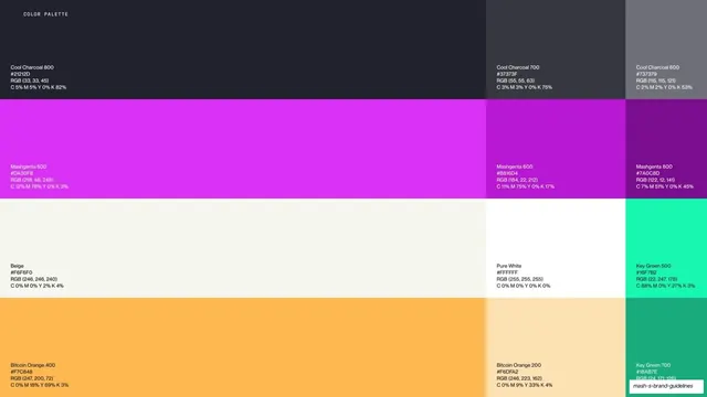
A reference for documenting a component system at the property level inside a brand or product guide. Reuse the four-column anatomy to onboard builders quickly. The named color tokens (Mashgenta, Cool Charcoal, Key Green) tie it back to the palette pages; keep those names consistent across the deck.
From this deck: Mash UI building blocks four-column spec
View deck















More like this
Keep what you find
A free account saves references to boards and can send you a weekly email of picks based on what you save.
To see every result, go Pro.