Preview image. Unlock full-res
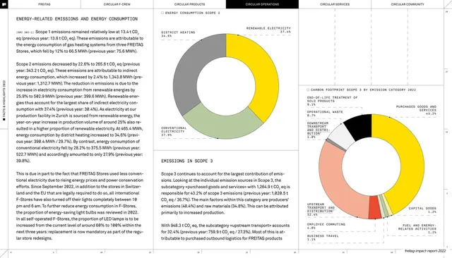
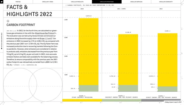
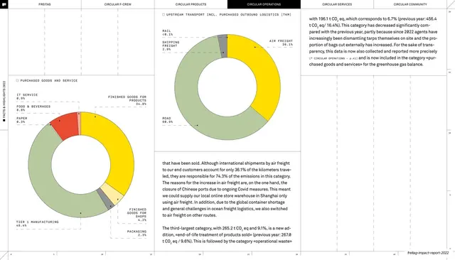
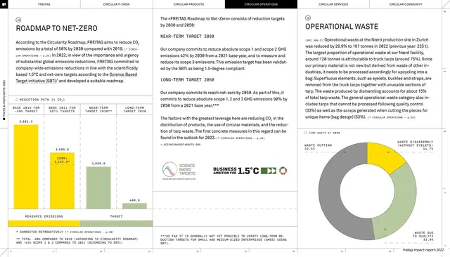
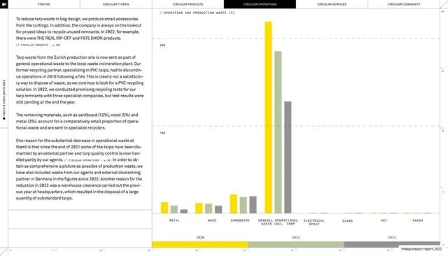
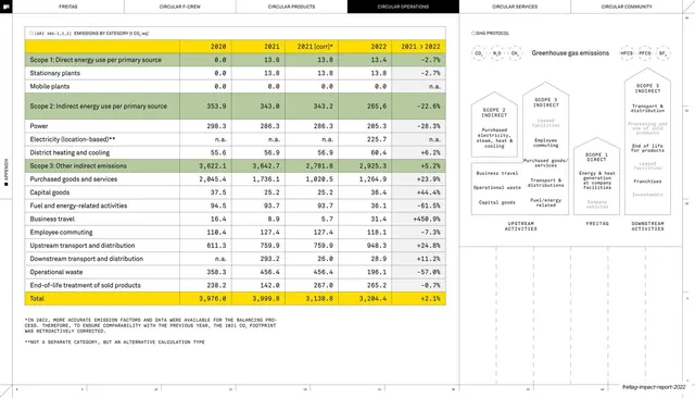
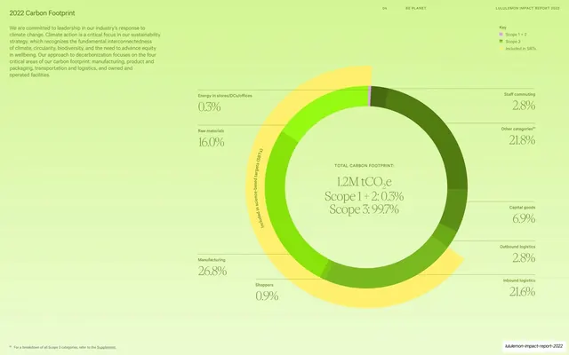
Text-and-charts spread with two labelled donut charts breaking down Scope 2 energy consumption and Scope 3 emissions by category in yellow, green and grey.
Summary
A running-text page on energy emissions, anchored by two donut charts: a Scope 2 energy-consumption ring top-centre and a larger Scope 3 emissions-by-category ring lower-right, both with leader-line labels.
Visual description
The six-tab header runs across the top with CIRCULAR OPERATIONS inverted. A heading "ENERGY-RELATED EMISSIONS AND ENERGY CONSUMPTION" opens a multi-column body of small justified paragraphs threaded with monospace GRI tags and percentage figures. Two donut charts break up the text: an upper one titled "ENERGY CONSUMPTION SCOPE 2" split into renewable electricity (yellow), conventional electricity (green) and district heating (grey); a lower-right one titled "CARBON FOOTPRINT SCOPE 3 BY EMISSION CATEGORY 2022" with a dominant yellow purchased-goods wedge and many small slices, every slice tagged with a label and percentage on thin leader lines. Faint hairline column rules and a numeric ruler frame the layout, and the deck-slug footer sits bottom-right.
Key takeaway
Embedding donut charts directly into a body-text column instead of isolating them, so data and explanation share a reading rhythm. The same three-color logic (yellow lead, green and grey support) ties the two rings together and to the rest of the deck.
Reuse notes
Good for report pages that need to break down a total into many categories without losing the surrounding argument. The leader-line labelling is essential for many-slice donuts; only works at print-grade resolution. Reserve the dense two-chart layout for genuinely data-heavy sections.
From this deck: Energy emissions donut charts
View deck












More like this




Keep what you find
A free account saves references to boards and can send you a weekly email of picks based on what you save.
To see every result, go Pro.