
Preview image. Unlock full-res
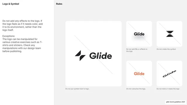
A misuse page with three "please do" thumbnails above two rows of crossed-out "do not" logo treatments.
Summary
A logo do-and-do-not page: a short top row of three correct uses, a hairline divider, then two rows of incorrect uses each marked with a red cross and a captioned reason.
Visual description
Warm off-white ground. Top left a "PLEASE DO" label introduces three light thumbnails (proper contrast, approved brand colors, ample clearspace). A thin rule separates them from a "DO NOT" block of ten thumbnails over two rows, each with a small red X in the corner and a monospace caption beneath: align diagonally, stretch it, change opacity, overlay on busy imagery, crop awkwardly, add a shadow, add a stroke, use incorrect file format, place on contrasting brand color, use unapproved colors. A right-aligned paragraph at top right explains why consistent mark usage matters across internal teams, partners, and press. Header: "DO/DO NOT GUIDELINES" / "LOGO FAMILY" / "BRAND GUIDELINES".
Key takeaway
The do-above / don't-below split with a single hairline between them reads instantly as right versus wrong. Each violation is its own captioned thumbnail with a red cross, so the rule and the example are never separated.
Reuse notes
A canonical misuse page for any brand manual. The grid expands to as many do-nots as the mark needs; keep the captions to two or three words and always pair the visual error with its label.
From this deck: Mash logo do and do-not page
View deck




































More like this







Keep what you find
A free account saves references to boards and can send you a weekly email of picks based on what you save.
To see every result, go Pro.