Preview image. Unlock full-res
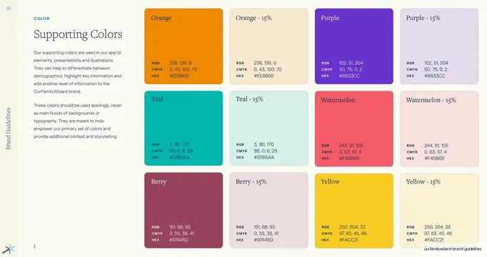
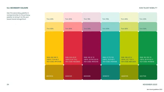
Supporting accent palette shown as full and 15% tint swatch cards in a 4-column grid, each with RGB, CMYK and HEX values.
Summary
The supporting (accent) color page: six bright accent colors, each shown at full strength and at a 15% tint, with full specs, meant for sparing use in UI and illustration.
Visual description
Two-column editorial layout. Left: teal eyebrow "COLOR", serif heading "Supporting Colors", and two grey paragraphs noting these are for app UI, presentations and illustrations and should be used sparingly. Right: a 4-column, three-row grid of swatch cards. Each accent appears twice, full color then a pale "15%" tint: Orange (#EE8800), Purple (#6633CC), Teal (#03B5AA), Watermelon (#F45B69), Berry (#97445D) and Yellow (#FACC21). Every card shows its name top-left and an RGB / CMYK / HEX block bottom-left. A page number "1" sits bottom-left. Vertical "Brand Guidelines" label and spark mark on the left edge.
Key takeaway
Pairing each accent with its 15% tint in adjacent cards, so the system documents both the saturated and the soft form of every supporting color in one row. The explicit "use sparingly" framing keeps the brand's calm core intact.
Reuse notes
A clean template for a secondary/accent palette that sits beneath a restrained primary palette. Reusable as-is: full color plus tint, consistent spec block. Good model for systems where bright colors are allowed but governed.
From this deck: Supporting Colors swatch grid
View deck














More like this



Keep what you find
A free account saves references to boards and can send you a weekly email of picks based on what you save.
To see every result, go Pro.