Preview image. Unlock full-res
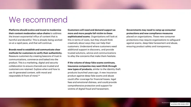
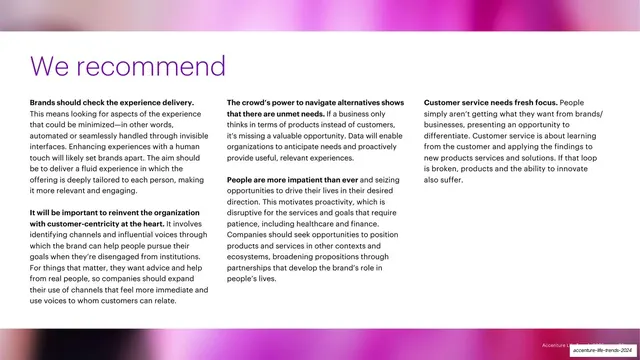
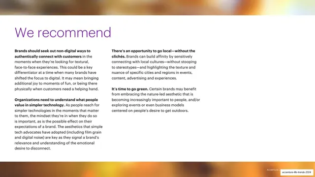
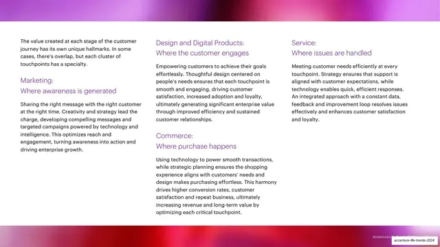
A purple "We recommend" headline over three columns of recommendation copy with bold lead-ins, framed top and bottom by full-bleed blurred photo bands.
Summary
The recurring "We recommend" page for a trend: a large purple headline over three columns of advice, each paragraph opening with a bold sentence, sandwiched between two thin full-bleed photo bands.
Visual description
White center band framed by a blurred photographic strip across the top edge and a darker, more saturated blurred strip across the bottom edge. Below the top band, an oversized purple "We recommend" headline sits at left. Three columns of black body copy follow, each recommendation led by a bold black sentence and continuing in regular weight, with footnote markers (34). The columns align to a shared baseline grid.
Key takeaway
The bold-lead-in pattern: each recommendation starts with a bolded thesis sentence so the page can be skimmed by reading only the bold text, then expanded by reading the rest. The two narrow photo bands top and bottom frame the advice without crowding it.
Reuse notes
A clean template for any "recommendations" or "action items" page that needs to present three to four parallel points at once. The bold-first-sentence convention is directly reusable for scannable list content. Keep the framing photo bands thin so they read as accent, not feature.
From this deck: We recommend (Trend 1) recommendations page
View deck
























More like this






Keep what you find
A free account saves references to boards and can send you a weekly email of picks based on what you save.
To see every result, go Pro.