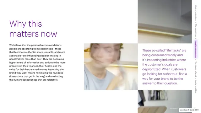
Preview image. Unlock full-res
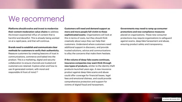
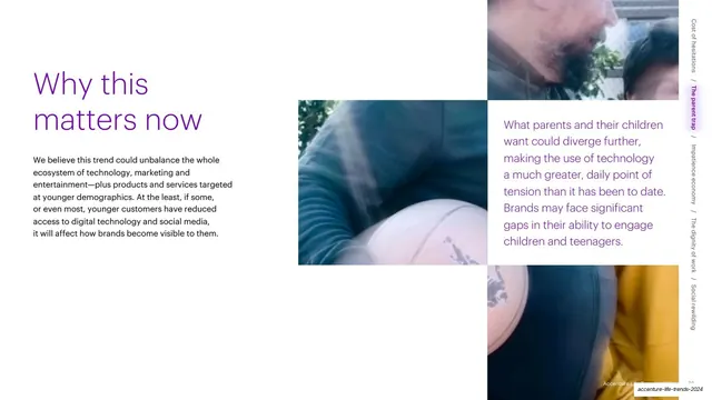
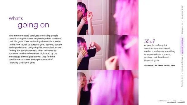
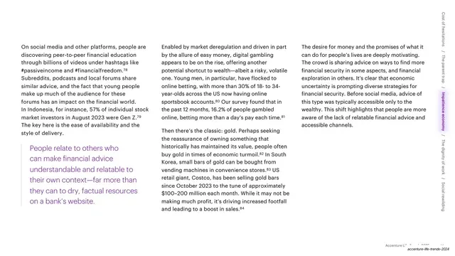
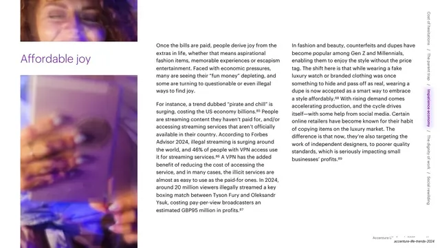
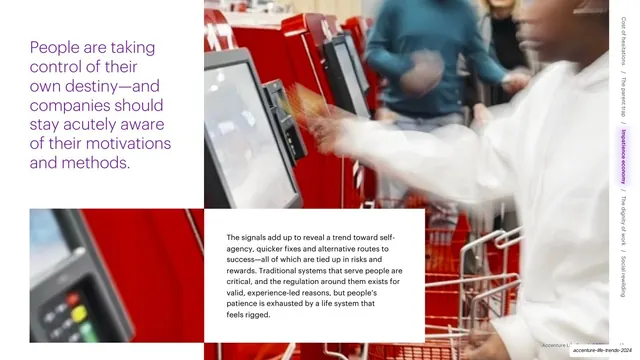
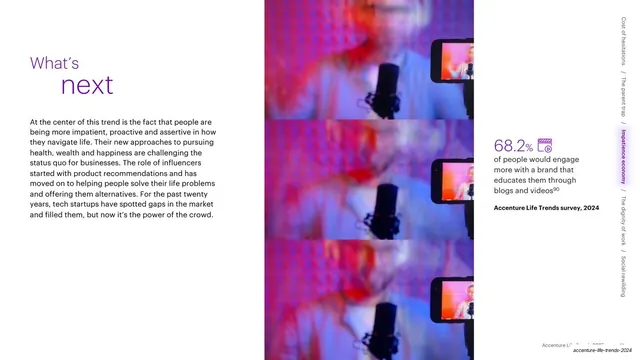
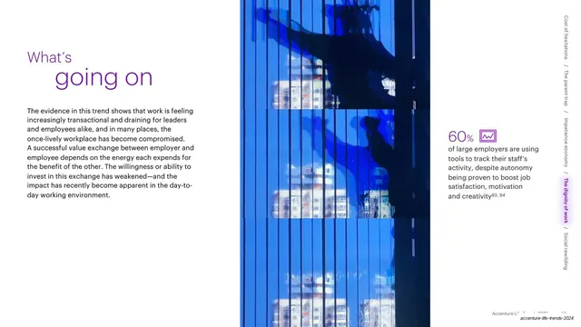
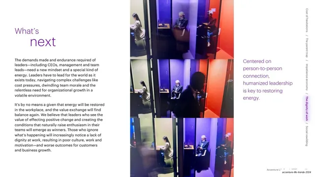
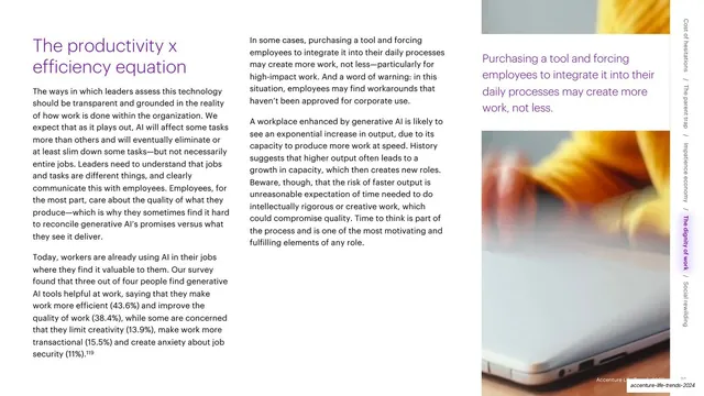
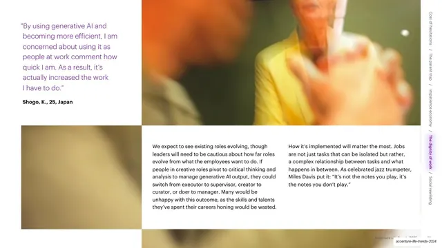
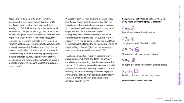
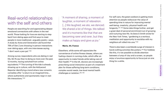
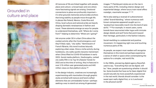
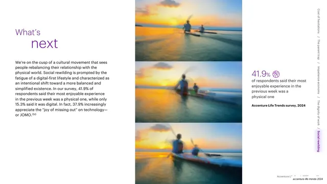
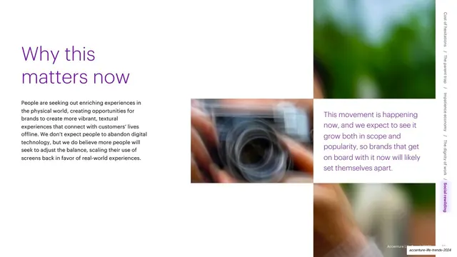
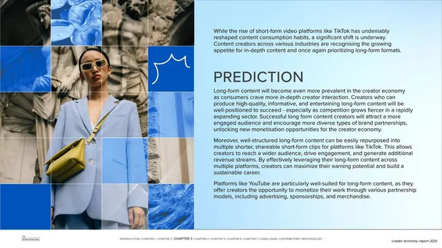
A "Why this matters now" slide with a two-weight purple headline, a clustered grid of blurred photos in the center, and a purple statement on the right, with the trend rail.
Summary
A "Why this matters now" slide wrapping the trend: the two-weight purple headline and a paragraph on the left, a clustered grid of blurred photos in the center, and a purple statement on the right.
Visual description
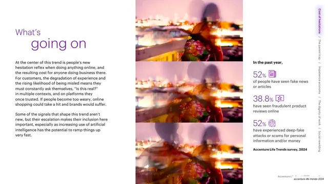
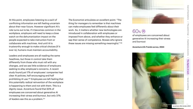
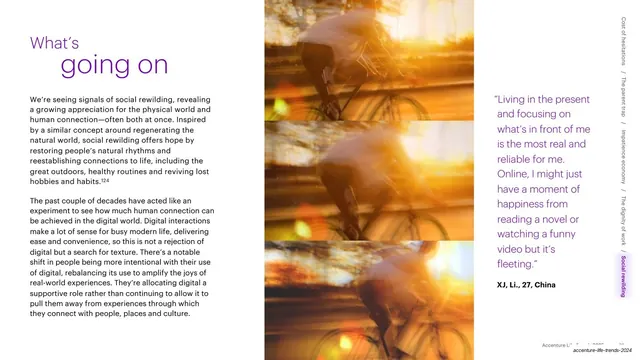
A white slide. Upper left, the recurring two-weight headline, "Why this" in thin purple over "matters now" in heavy purple, sits above a single paragraph of dark body text. The center holds an offset cluster of three or four motion-blurred photographs arranged in a loose grid. The right column carries a purple statement ("These so-called 'life hacks' are being consumed widely and it's impacting industries..."). The vertical trend rail runs up the far right edge with "Impatience economy" highlighted in purple.
Key takeaway
The "Why this matters now" beat as a recurring section-closer with its own two-weight headline, here paired with a loose photo cluster instead of a single stack, adding a more dynamic image arrangement while keeping the layout language intact.
Reuse notes
Use as a consistent section-wrap slide so every chapter ends on the same "so what" note. The clustered photo grid is a livelier alternative to the vertical stack when you have several images of equal weight. Keep the closing purple statement forward-looking.
From this deck: Why this matters now with photo grid and purple statement
View deck





More like this



Keep what you find
A free account saves references to boards and can send you a weekly email of picks based on what you save.
To see every result, go Pro.