Preview image. Unlock full-res
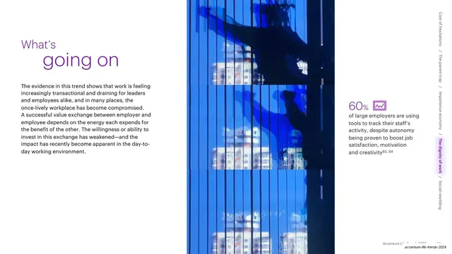
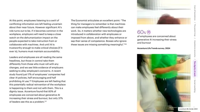
Three-zone slide pairing a purple two-tone "What's going on" headline and body text with a tall blue skyscraper photo and a 60% stat callout.
Summary
A three-column working slide: a purple two-tone "What's going on" headline with a paragraph on the left, a tall vertical photograph of a blue glass skyscraper in the center, and a 60% statistic with a small icon on the right.
Visual description
The layout reads in three vertical zones. Left: a headline set in two weights and a purple-to-darker tone, "What's" small above and "going on" larger below, then a paragraph of dark body copy about work becoming transactional. Center: a tall narrow photograph, slightly blurred, of a bright blue mirror-glass building facade. Right: a large purple "60%" with a small line-art chart icon in a rounded box, followed by supporting copy in dark text with superscript footnote numbers. A vertical running navigation sits along the far right edge, listing the five trend names rotated 90 degrees with slashes between them, the current "The dignity of work" item highlighted on a soft purple tab. A faint Accenture Life Trends footer is bottom-right.
Key takeaway
The recurring three-zone grammar: headline column, image column, evidence column. The oversized purple percentage with a tiny matching icon makes a single statistic the visual anchor without a full chart. The rotated right-edge trend nav doubles as a progress indicator across a long deck.
Reuse notes
A reliable content template for data-backed trend or research decks that repeat across many sections. Reuse the headline-image-stat triad to keep dozens of slides consistent. The vertical edge nav needs a fixed, short list of sections to work; with too many items it becomes unreadable.
From this deck: What's going on with a 60% stat callout
View deck













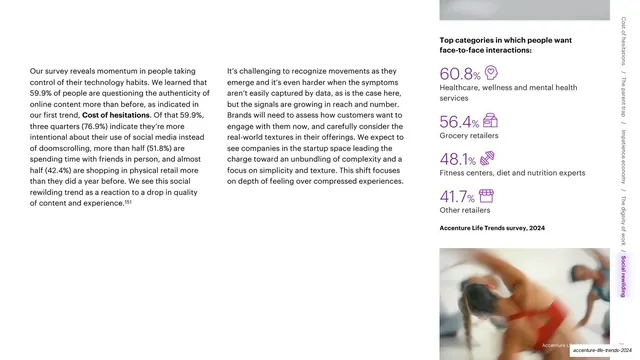
More like this





Keep what you find
A free account saves references to boards and can send you a weekly email of picks based on what you save.
To see every result, go Pro.