Preview image. Unlock full-res
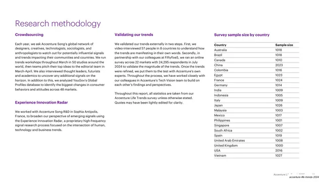
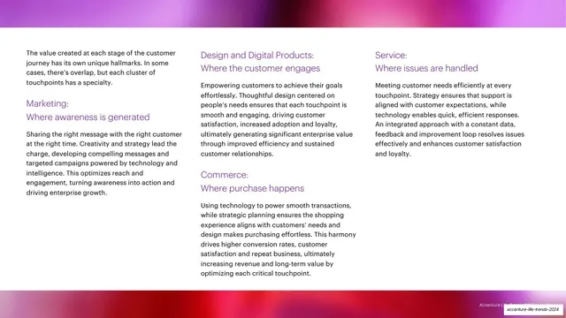
White slide with purple two-line subheadings naming five customer-experience touchpoints, each over a paragraph of black copy in a three-column layout, framed by magenta-to-red gradient bands top and bottom.
Summary
A capabilities slide laying out five customer-experience touchpoints as purple two-line subheadings over short black paragraphs, in a three-column grid framed by warm gradient bands.
Visual description
White background with soft magenta-to-red gradient bands bleeding off the top and bottom edges. Content is set in three columns. The left column opens with a short black intro paragraph, then a purple two-line subheading "Marketing: Where awareness is generated" over body copy. The center column carries "Design and Digital Products: Where the customer engages" and "Commerce: Where purchase happens," each as a purple two-line subheading over a paragraph. The right column carries "Service: Where issues are handled." Each subheading pairs a bold capability name with an italic-feeling descriptor line, all in purple. No vertical trend tab. Faint footer line and slug bottom-right.
Key takeaway
The repeated two-line purple subheading format, a noun label plus a "where X happens" descriptor, turns a services list into a consistent, scannable system. Distributing five items across three columns keeps it dense but ordered.
Reuse notes
A strong pattern for a capabilities or service-offering page where each item needs a name and a one-line role. The label-plus-descriptor unit is portable to any column count. Keep paragraphs short and even so the columns stay balanced.
From this deck: Customer touchpoints three-column slide
View deck