Preview image. Unlock full-res
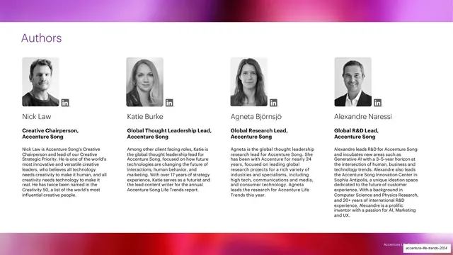
White slide with a purple "Authors" title over a four-column row of author profiles, each a square grayscale headshot with a LinkedIn glyph, name, bold role and bio, framed by magenta-to-red gradient bands.
Summary
An "Authors" slide presenting four author profiles in a single row, each with a square grayscale headshot, a LinkedIn glyph, a name, a bold role and a short bio, framed by warm gradient bands.
Visual description
White background with soft magenta-to-red gradient bands bleeding off the top and bottom edges. A purple title "Authors" sits upper-left. Below, four equal columns each hold a square grayscale portrait with a small LinkedIn icon at the lower-right corner of the photo, a name in regular black (Nick Law, Katie Burke, Agneta Bjornsjo, Alexandre Naressi), a bold black two-line role ("Creative Chairperson, Accenture Song" and similar), and a paragraph of small black bio text. The four profiles are uniform in size and alignment. No vertical trend tab. Faint footer line and slug bottom-right.
Key takeaway
The uniform author-card row: square monochrome headshot, inline social glyph, name, bold role, bio, repeated four-up. Greyscaling the portraits unifies otherwise mismatched headshots into one coherent set.
Reuse notes
A clean team or authors layout for report back-matter, an about page, or a credits slide. Converting all headshots to grayscale is the key trick for visual consistency across photos shot in different conditions. Scales to three or five columns by adjusting bio length.
From this deck: Authors four-column profile slide
View deck

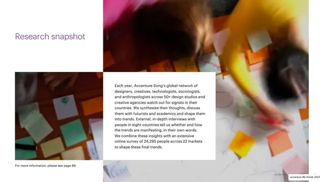

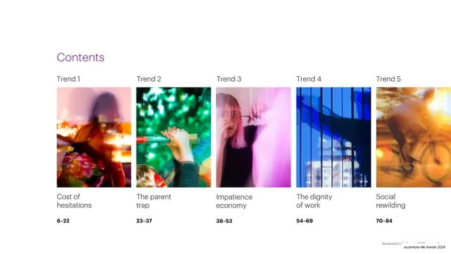


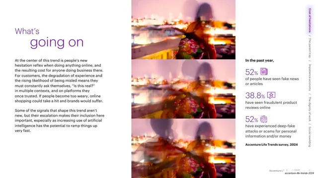










































More like this








Keep what you find
A free account saves references to boards and can send you a weekly email of picks based on what you save.
To see every result, go Pro.