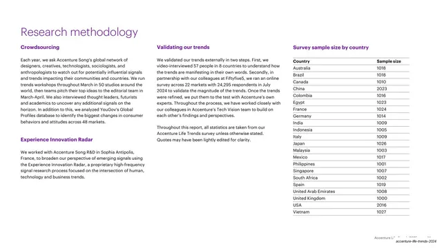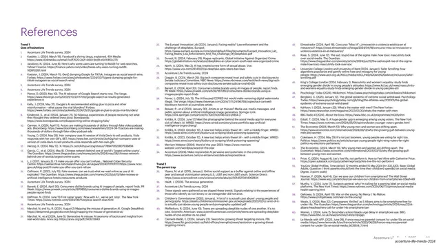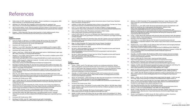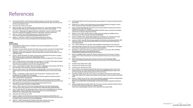
Preview image. Unlock full-res
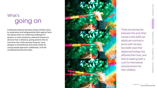
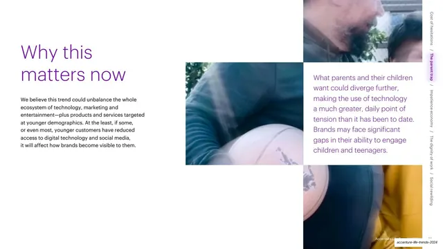
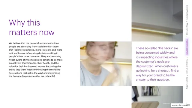
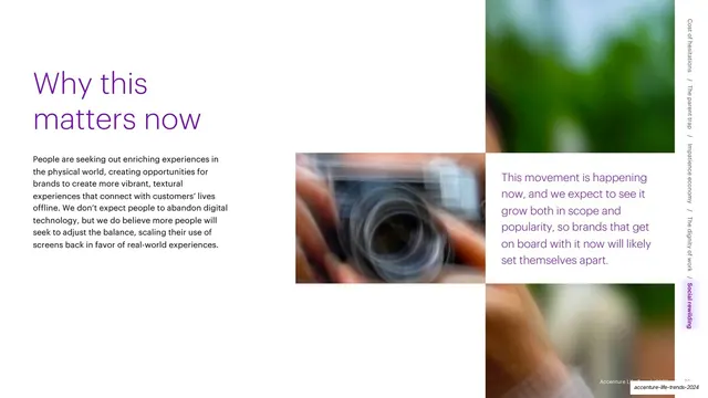
A two-tone purple "Why this matters now" headline over body copy, a centered blurred photo block, and a purple pull-quote column on a white grid.
Summary
The recurring "Why this matters now" closer for a trend section: a large two-tone purple headline at left over a paragraph, a central blurred photo, and a purple pull-quote on the right.
Visual description
White page on a three-zone grid. Top-left, a two-line headline reads "Why this" in lighter purple and "matters now" in stronger purple, with a black body paragraph beneath. The center holds a blurred green and orange lifestyle photo of a person with a phone. The right third is a longer pull-quote set entirely in purple, summarizing the stakes. The vertical trend navigation runs down the far-right edge. Photo block and quote block sit on aligned grid rows with white gutters.
Key takeaway
The repeatable section-closer formula: a fixed two-tone headline, a short context paragraph, a mood image, and a colored summary quote. Reusing the exact same layout at the end of every section gives a long report a predictable rhythm and makes each trend feel self-contained.
Reuse notes
Ideal as a template you stamp at the end of each chapter or section of a multi-part report or trends deck. The two-tone headline (one word soft, one word bold) is a small, cheap way to add typographic interest without a second typeface. Keep the pull-quote color consistent with the headline accent.
From this deck: Why this matters now (Trend 1) text page
View deck