Preview image. Unlock full-res
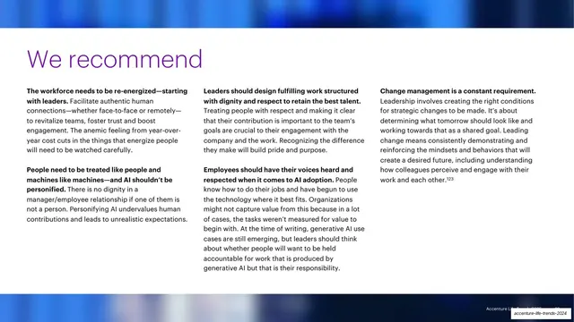
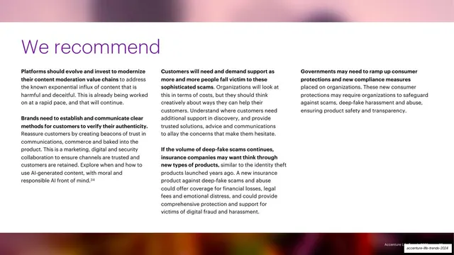
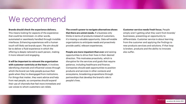
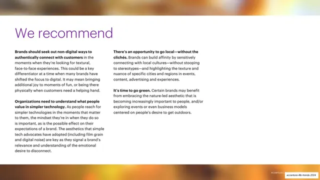
Recommendations slide with a large purple "We recommend" headline over three columns of bold-led action points, framed top and bottom by blue gradient photo bands.
Summary
The chapter's recommendations slide: a large purple "We recommend" headline sits above three columns of recommendations, each opening with a bold lead-in sentence, framed top and bottom by blurred blue gradient photo bands.
Visual description
A white slide bracketed by two horizontal bands of blurred, deep-blue gradient imagery, one across the top, one across the bottom. Between them, a large purple "We recommend" headline runs across the upper area. Below it, three columns of dark sans-serif body copy each begin with a bold dark lead-in (for example "The workforce needs to be re-energized, starting with leaders," "People need to be treated like people and machines like machines, and AI shouldn't be personified," "Leaders should design fulfilling work structured with dignity and respect to retain the best talent"), followed by explanatory text and a superscript footnote (123). Unlike the body slides, there is no rotated trend nav on this layout.
Key takeaway
The full-width "We recommend" recommendations format: one big headline, then a parallel three-column list where every item leads with a bold one-line directive. The blue gradient bands top and bottom signal a special summary slide, distinct from the regular body pages.
Reuse notes
A strong end-of-chapter or end-of-deck action slide. The bold-lead-in-then-explanation pattern makes recommendations skimmable. Reuse the gradient-band framing to mark "key takeaways" moments; dropping the side nav here helps it read as a deliberate punctuation point.
From this deck: We recommend three-column recommendations slide
View deck


























More like this





Keep what you find
A free account saves references to boards and can send you a weekly email of picks based on what you save.
To see every result, go Pro.