Preview image. Unlock full-res
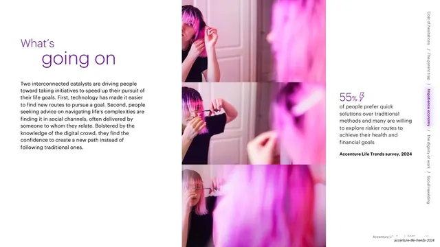
A split slide with two paragraphs of body text on a white left panel and a full-height blurred pink gradient image filling the right half.
Summary
The opening text spread for Trend 3: a white left half carrying two paragraphs of intro copy, butted against a full-height abstract pink-blur image on the right.
Visual description
The slide splits roughly in half. The left panel is white with two paragraphs of dark sans-serif body text, one phrase ("Decade of deconstruction") bolded and a small superscript footnote number ending a line. The right half is a soft, out-of-focus magenta and pink gradient image bleeding to all three edges. A faint footer runs along the bottom right.
Key takeaway
The clean half-text, half-image split where the image is a soft abstract field rather than a literal photo, letting the color do the work and keeping the text side calm and legible. The superscript footnotes embed sourcing without cluttering the layout.
Reuse notes
A dependable body-intro layout for report decks that want a calm reading column next to a color-coded image. The abstract blur is easy to theme per section. Best when the copy is genuinely two tidy paragraphs; longer text would need the three-column variant instead.
From this deck: Impatience economy intro split text and image
View deck