Preview image. Unlock full-res
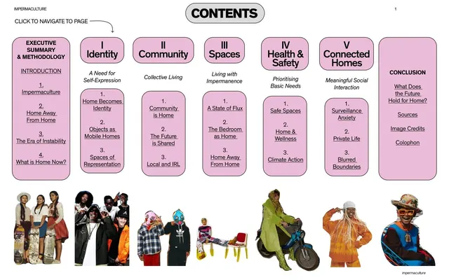
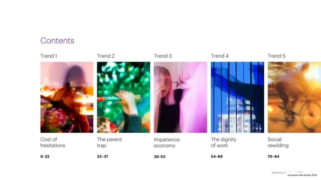
Contents page laying out the five trends as a horizontal row of color-coded photo thumbnails, each labeled Trend N with a title and a bold page range.
Summary
The contents page: the five trends laid out left to right as a row of motion-blurred photo thumbnails, each tagged "Trend N" above and given a title and a bold page range below.
Visual description
On white, a purple "Contents" headline sits upper-left. Below runs a horizontal row of five tall rectangular photo thumbnails, evenly spaced and edge-to-edge across the page, each blurred and color-distinct: a warm magenta street scene, a green festive scene, a pink portrait, a blue glass facade, and an amber cyclist. A small "Trend 1" through "Trend 5" label sits above each thumbnail; below each is the trend title ("Cost of hesitations", "The parent trap", "Impatience economy", "The dignity of work", "Social rewilding") and a bold page range ("6-22", "23-37", "38-53", "54-69", "70-84"). The fifth thumbnail runs off the right edge.
Key takeaway
Turning a table of contents into a visual index by giving each section its own color-coded image thumbnail, so the five trends become recognizable by image and hue before a single word is read. The consistent label / title / page-range stack under each thumbnail keeps it scannable.
Reuse notes
A strong contents pattern for any multi-section report or magazine where each section already has a signature image and color. Works best with exactly the number of columns that fit cleanly across the width; here the slight bleed of the fifth item hints at scroll or continuation. The per-section color coding pays off if it is reused on the matching divider slides.
From this deck: Contents, five trends
View deck