Preview image. Unlock full-res
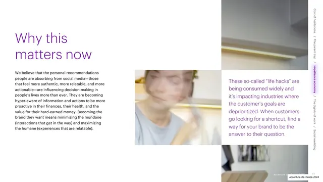
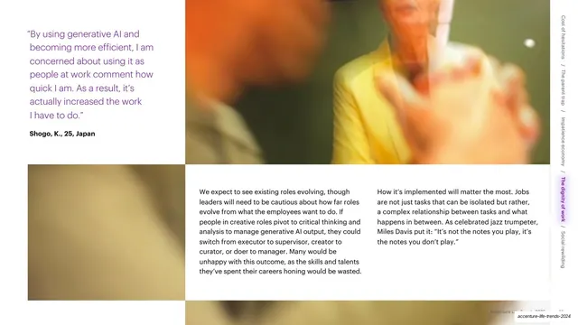
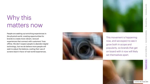
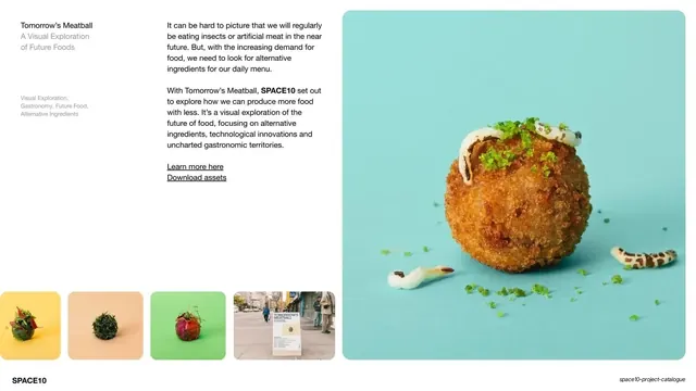
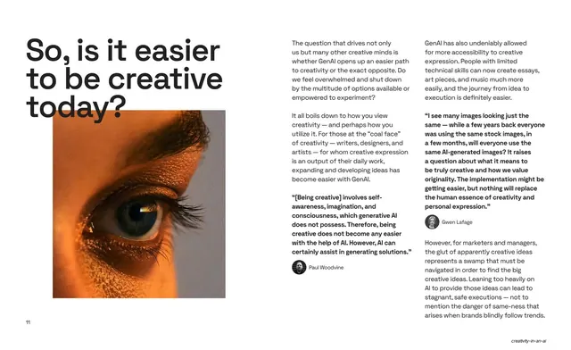
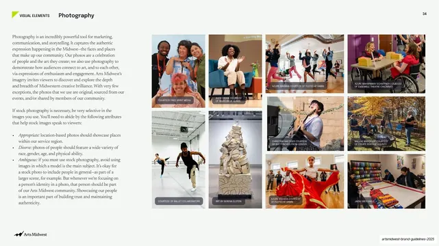
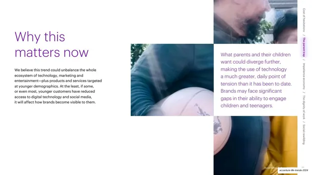
A two-tone purple "Why this matters now" headline over body copy at left, two stacked blurred photo blocks in the center, and a purple summary quote on the right.
Summary
The "Why this matters now" closer for Trend 2: a two-tone purple headline with a short paragraph at left, two stacked blurred photo blocks in the center, and a purple summary quote on the right, mirroring the same closer from Trend 1.
Visual description
White page on a three-zone grid. Top-left, "Why this" appears in lighter purple above "matters now" in bolder purple, with a black paragraph beneath. The center holds two stacked blurred photo blocks (a person with a basketball, warm and cool tones) with white gutters. The right third is a purple summary statement about brands facing gaps in engaging children and teenagers. The rotated trend navigation runs down the far-right edge with the active trend highlighted in a pink pill.
Key takeaway
Repeating the exact "Why this matters now" closer layout across sections (headline, short paragraph, stacked images, colored summary) so every chapter ends on the same beat. The consistency turns a 90-plus-slide report into a series of recognizable, self-contained units.
Reuse notes
Treat this as the matching bookend to the same-named closer earlier in the deck; reuse it verbatim at the end of every trend. The stacked center images can carry each chapter's color theme. Keep the right-side summary in the accent color and short enough to read as a takeaway.
From this deck: Why this matters now (Trend 2) with photo grid and quote
View deck