Preview image. Unlock full-res
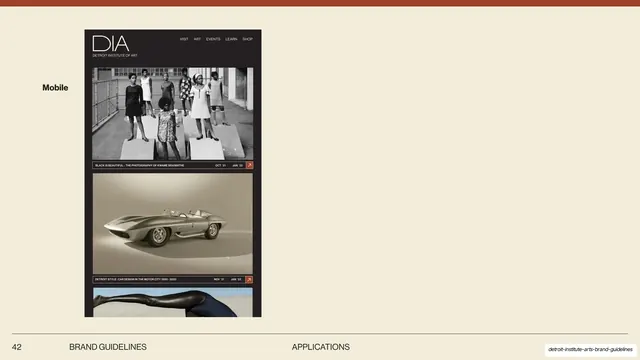
Single mobile screen of the responsive DIA site, stacking the DIA wordmark, a compact nav, and a vertical column of captioned exhibition cards on charcoal.
Summary
The responsive counterpart to the website slide: one mobile screen stacking the DIA wordmark, a compact nav, and a single vertical column of captioned exhibition cards on charcoal.
Visual description
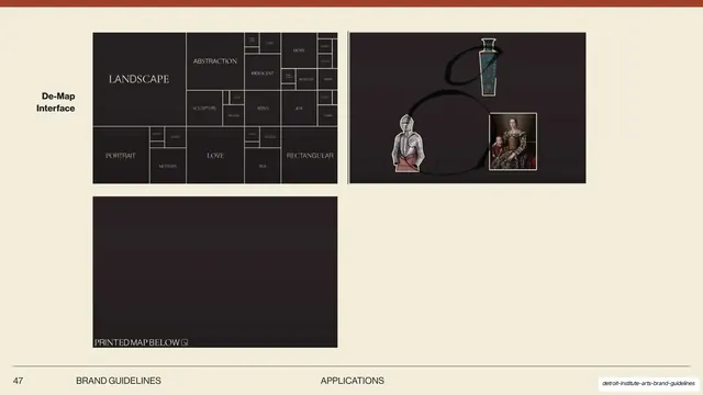
Cream slide, thin terracotta top band, left-margin bold sans-serif label "Mobile". A single tall mobile mockup sits left of center, mostly empty cream to its right. The dark charcoal screen shows a thin-serif "DIA" mark with "DETROIT INSTITUTE OF ART" beneath it at top left, a compact right-aligned nav (VISIT / ART / EVENTS / LEARN / SHOP), then a single stacked column of exhibition cards: a black-and-white group photo, a silver concept car on tan, and a partly cropped third image, each closed by a dark caption bar with title, date range and an orange corner arrow tile. The foot of the slide carries "42", "BRAND GUIDELINES" and a centered "APPLICATIONS".
Key takeaway
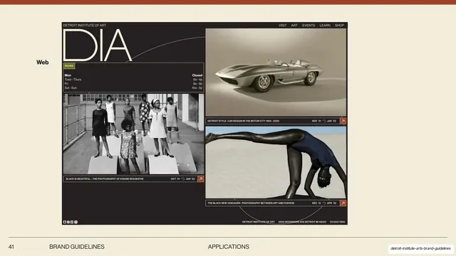
Reflowing the same card system from the desktop slide into one mobile column without redesigning anything, the dark caption bar and orange arrow tile carrying straight across breakpoints. It shows the identity is responsive by reusing components, not reinventing them.
Reuse notes
Pair this directly with a desktop web slide to demonstrate responsive consistency in an identity deck. The single-column card stack is a safe default for any content-driven mobile site. The generous empty space at right is a slide-layout choice; a tighter frame would read more finished. Pairs with slide 41 in this deck.
From this deck: DIA mobile website application
View deck





More like this






Keep what you find
A free account saves references to boards and can send you a weekly email of picks based on what you save.
To see every result, go Pro.