Preview image. Unlock full-res
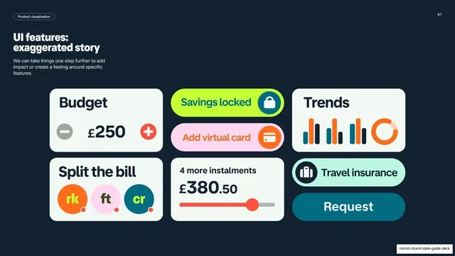
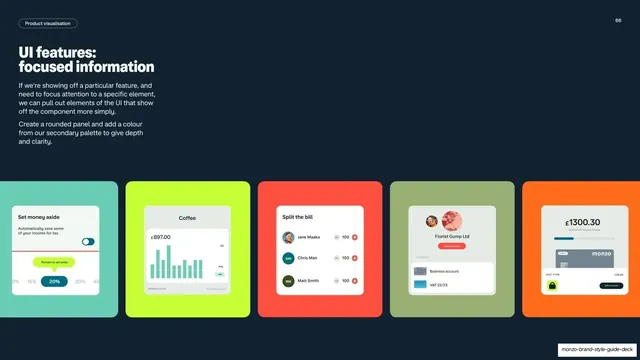
Dark slide on the focused-information level, with left copy and five colored cards each isolating a single simplified UI panel.
Summary
A detail slide for the "focused information" level: left-column copy with five colored cards across the bottom, each pulling out one simplified UI component on a secondary-palette panel.
Visual description
Dark navy background, white "Product visualisation" pill top-left and page number "66" top-right. The left column has a white two-line headline "UI features: focused information" and two short paragraphs about pulling out UI elements onto a rounded panel with a secondary-palette color for depth. Across the bottom, five rounded cards in different muted colors (mint, lime, coral, sage, orange), each holding a single isolated UI element: a "Set money aside" percent slider, a "Coffee" spending chart, a "Split the bill" three-person panel, a "Florist Gump Ltd" business-account panel, and a balance-and-card pot panel. Each component sits on a soft inner card.
Key takeaway
Isolating one component per card so a single feature can be spotlit without the surrounding app chrome. Backing each cut-out UI piece with a secondary-palette panel adds depth and turns a flat fragment into a deliberate graphic.
Reuse notes
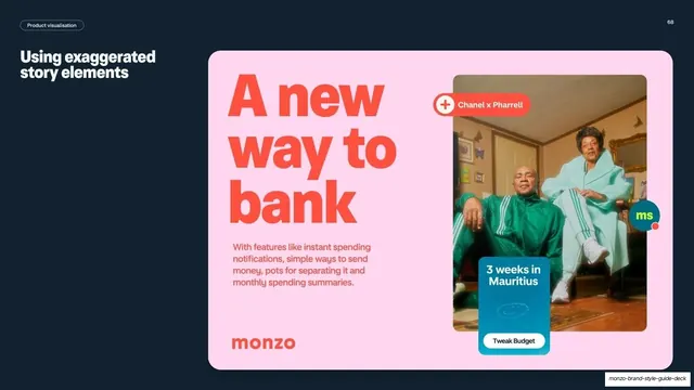
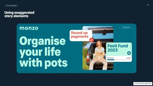
A reusable middle-fidelity pattern for feature spotlights in marketing or onboarding. The isolated-component-on-colored-panel card works anywhere you need to highlight one control. Keep the panels on the secondary palette so they read as a set distinct from full screens.
From this deck: Monzo UI features focused information
View deck