Preview image. Unlock full-res
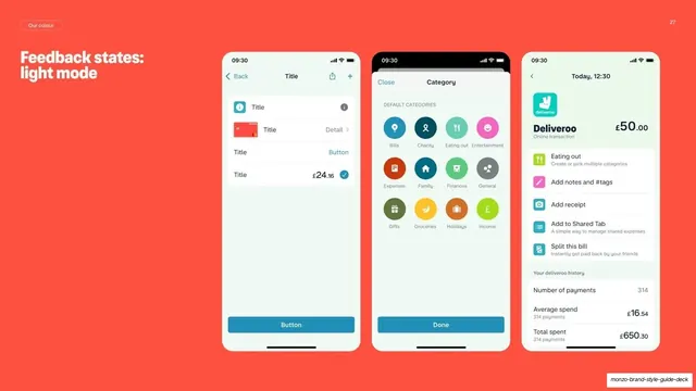
Coral guideline page showing three light-mode Monzo app screens to demonstrate feedback states and interactive components in context.
Summary
A coral page presenting feedback states in their real light-mode setting via three Monzo app screens placed side by side.
Visual description
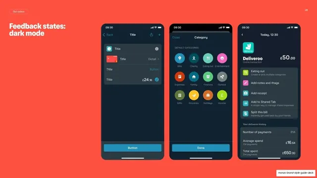
Full hot-coral background with a "Our colour" pill top-left and a two-line "Feedback states: light mode" heading. Three light-UI phone screens sit in a row: a list screen with title/detail rows and a teal "Button"; a category-picker grid of round coloured icons (Bills, Charity, Eating out, etc.) with a "Done" button; and a Deliveroo transaction-detail screen showing spend totals and action rows. The bright coral field frames the white screens.
Key takeaway
Showing UI states inside three full real app screens, rather than as isolated components, proves the system works in practice. Floating the white screens on a saturated brand colour makes a documentation page feel like a campaign visual.
Reuse notes
Use as the light-mode half of a light/dark feedback-states pair (it mirrors slide 28). The coral backdrop is reusable for any phone-screen showcase that needs energy. Requires polished real screens to carry the page.
From this deck: Monzo feedback states light mode
View deck

More like this
Keep what you find
A free account saves references to boards and can send you a weekly email of picks based on what you save.
To see every result, go Pro.