Preview image. Unlock full-res
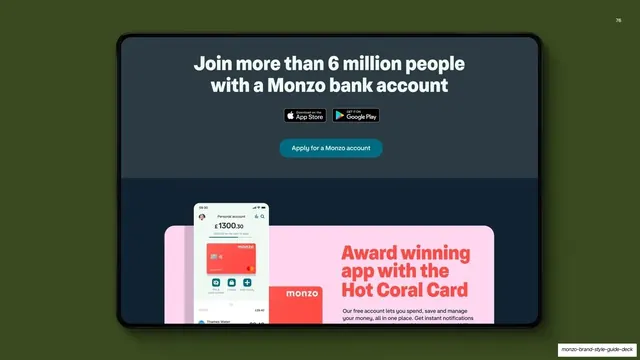
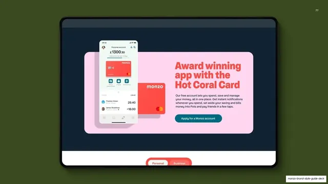
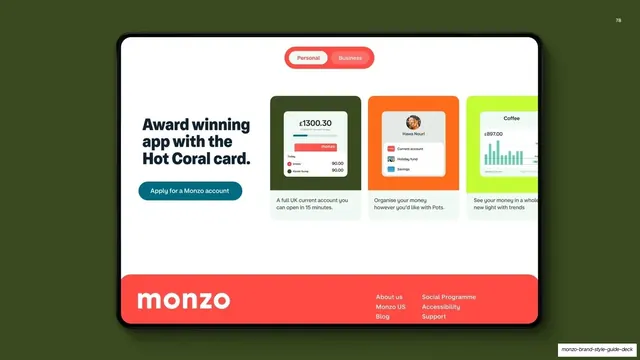
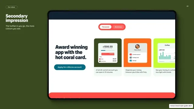
Khaki guideline page showing a colourful Monzo app-features web section on a tablet to illustrate that more colour appears deeper in the experience.
Summary
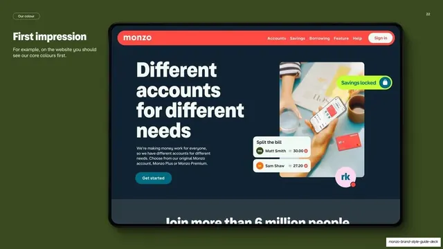
The counterpart to the first-impression page: a khaki page showing that the deeper a customer goes, the more secondary colour appears, via a colourful app-features section on a tablet.
Visual description
Deep khaki-green background. Top-left holds a "Our colour" pill, a two-line "Secondary impression" heading, and the caption "The further in you go, the more colours you see." The right side shows a perspective tablet displaying a light Monzo web section: a coral "Personal / Business" pill toggle, an "Award winning app with the hot coral card." headline, a teal "Apply for a Monzo account" button, and three feature cards in khaki, orange and neon green showing account, Pots and trends UI. A coral band peeks along the bottom edge of the screen.
Key takeaway
Pairing this with the previous "First impression" page builds a clear before/after argument about colour depth using two near-identical tablet layouts. Swapping the mockup from restrained to colourful does the explaining.
Reuse notes
Use as the second half of a two-page colour-progression story in a guideline. The matched tablet treatment keeps the pair visually consistent. Needs a genuinely more colourful screen to read as the "deeper" state.
From this deck: Monzo secondary impression mockup
View deck