Preview image. Unlock full-res
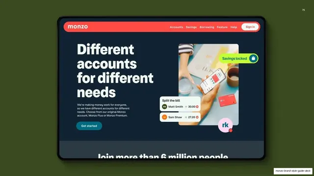
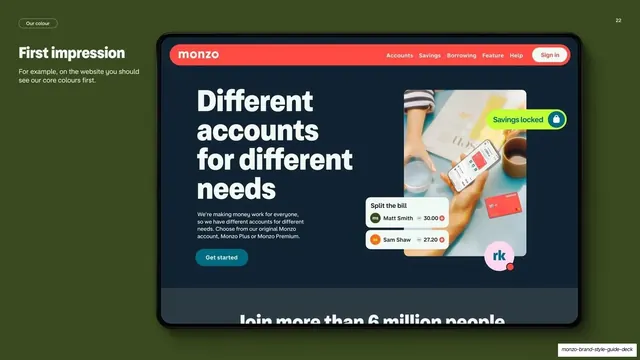
Khaki guideline page showing a Monzo website hero on a tilted tablet to illustrate that core colours should appear first.
Summary
A deep khaki page making the point that on the website the core colours should be seen first, shown via a Monzo homepage hero on a tilted tablet.
Visual description
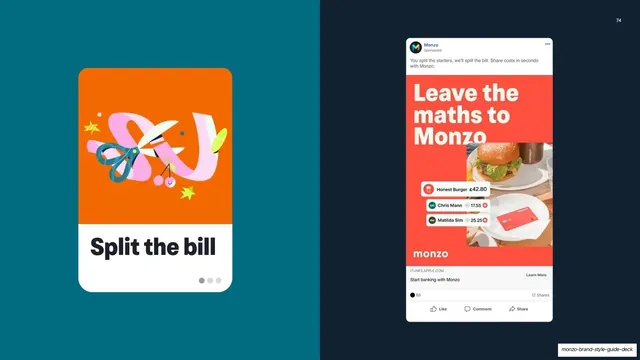
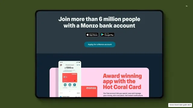
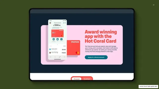
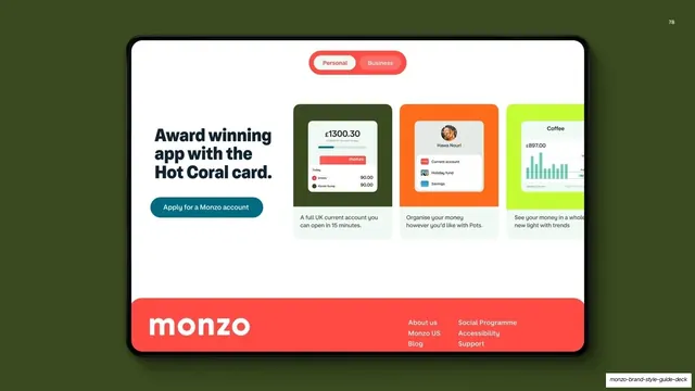
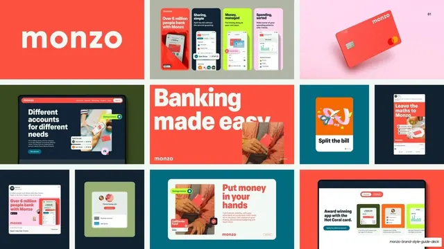
Full khaki-green background with a soft shadow. Top-left, a "Our colour" pill, the "First impression" heading, and one line of guidance: "For example, on the website you should see our core colours first." The right two-thirds is filled by a large tablet rendered in slight perspective showing a Monzo website hero: a coral nav bar with the wordmark, a huge white "Different accounts for different needs" headline on dark navy, body copy, a teal "Get started" button, a lifestyle photo, floating "Split the bill" and "Savings locked" UI snippets.
Key takeaway
Putting a single full hero mockup on a perspective tablet against a flat brand colour makes one example feel like a finished product shot. The minimal caption lets the mockup carry the lesson.
Reuse notes
Good for a guideline page that needs to show brand colour in a real digital context rather than as swatches. The tilted device works when you have one strong screen to feature. The khaki field is from the secondary palette; swap for any brand colour.
From this deck: Monzo first impression website mockup
View deck