Preview image. Unlock full-res
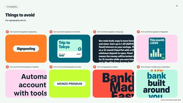
Light slide showing eight don't examples of misused typography as a two-row grid of bright cards, each topped by a red error icon and caption.
Summary
A light don'ts page: eight typography mistakes laid out as a four-by-two grid of bright cards, each marked with a red circled-cross icon and a one-line caption of what not to do.
Visual description
Off-white background. Top-left pill "Our typography", page "40" top-right. Title "Things to avoid" with the sub-line "Our typography don'ts". Below, a two-row grid of eight rounded cards in the brand palette (orange, teal, pink, dark navy, lime). Each card sits under a small red circled-cross error icon and a short caption: "Don't use the hero typeface in signposting" over an orange card with a "Signposting" pill, "Don't use the hero typeface in UI elements" over a teal "Trip to Tokyo" widget, "Don't use the hero typeface in body copy" over dense navy text, "Don't use the hero typeface in infographics" over a pink card with a balance widget, "Don't use the functional typeface in headlines", "Don't use the functional typeface in all caps" over a lime "MONZO PREMIUM" pill, "Don't set typography too tightly" over an overlapping coral headline, and "Don't set type in multiple colour combinations" over a clashing teal card.
Key takeaway
Building an entire rules page from cropped "wrong" examples rather than prose, each capped with the same red error icon for instant scanning. Reusing the brand's own card system as the canvas keeps the don'ts on-brand while still reading as warnings.
Reuse notes
A clean don'ts/misuse template for any guideline section, pairs naturally with a matching do's page. The error-icon-plus-caption-plus-example unit is directly reusable. Needs eight clearly-wrong examples that still look like plausible mistakes.
From this deck: Typography things to avoid grid
View deck






More like this
Keep what you find
A free account saves references to boards and can send you a weekly email of picks based on what you save.
To see every result, go Pro.