Preview image. Unlock full-res
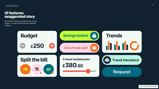
Dark slide on the exaggerated-story level, with left copy and a grid of oversized simplified UI chips, toggles and graphics.
Summary
A detail slide for the "exaggerated story" level: left-column copy with a grid of oversized, simplified UI chips and graphics that dramatize individual features.
Visual description
Dark navy background, white "Product visualisation" pill top-left and page number "67" top-right. The left column has a white two-line headline "UI features: exaggerated story" and a short paragraph about adding impact or feeling around specific features. The right area is a loose grid of large simplified UI graphics: a white "Budget / £250" card with minus and plus circles, a lime "Savings locked" pill with a lock, a coral "Trends" bar-and-donut chart card, a white "Split the bill" card with three oversized initial avatars, a pink "Add virtual card" pill, a white "4 more instalments / £380.50" card with a coral slider, a mint "Travel insurance" pill, and teal "Request" button. Everything is enlarged and stripped back well beyond real app scale.
Key takeaway
Pushing UI to poster scale and stripping detail so a single feature reads as a bold graphic with emotional impact. Mixing oversized chips, toggles and charts from the secondary palette gives a lively, varied composition while staying on-system.
Reuse notes
A reusable high-impact pattern for hero feature graphics in campaigns, social, or event screens. The oversized-chip grid works wherever literal UI would feel too small or dry. Use sparingly and on the secondary palette so it stays distinct from realistic product shots.
From this deck: Monzo UI features exaggerated story
View deck