Preview image. Unlock full-res
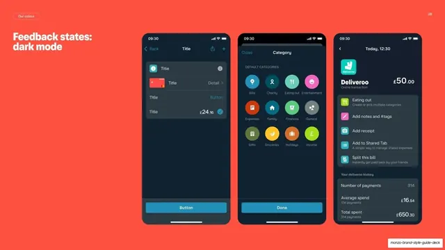
Coral guideline page showing the same three Monzo app screens in dark mode to demonstrate feedback states across themes.
Summary
The dark-mode counterpart to the previous page: a coral background carrying the same three Monzo screens, now in dark theme, to show feedback states hold up across modes.
Visual description
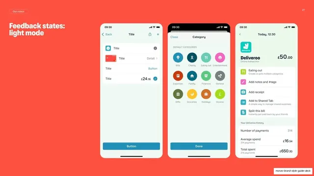
Full hot-coral background, "Our colour" pill top-left, two-line "Feedback states: dark mode" heading. The same three phone screens as slide 27 appear in dark theme: a dark list screen with title/detail rows and a teal "Button"; a dark category-picker grid of round coloured icons; and a dark Deliveroo transaction-detail screen with spend totals. The layouts match the light versions exactly, swapping only the UI surface colour.
Key takeaway
Repeating an identical three-screen layout in the opposite theme lets a reader compare light and dark behaviour one page apart with zero re-reading. Holding the coral backdrop constant signals "same content, different mode."
Reuse notes
The dark-mode half of the feedback-states pair (mirrors slide 27). The matched-layout-across-themes approach is reusable wherever a product must document both modes. Keep the framing identical to its light twin so the only variable is the theme.
From this deck: Monzo feedback states dark mode
View deck


More like this

Keep what you find
A free account saves references to boards and can send you a weekly email of picks based on what you save.
To see every result, go Pro.