Preview image. Unlock full-res
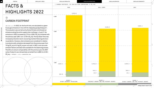
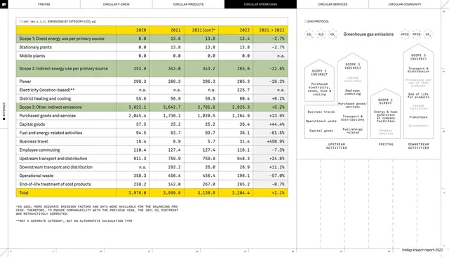
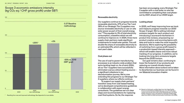
Facts and highlights spread pairing a dense carbon-footprint write-up with three tall stacked bars comparing 2020-2022 emissions by scope in yellow and green.
Summary
A "FACTS & HIGHLIGHTS 2022" data spread: an oversized headline and a dense carbon-footprint paragraph on the left, and three tall stacked bars on the right comparing 2020, 2021 (corrected) and 2022 emissions split by scope.
Visual description
The six-tab running header runs across the top with CIRCULAR OPERATIONS inverted black. Top-left carries a very large two-line headline "FACTS & HIGHLIGHTS 2022", a circled-arrow icon, a subhead "CARBON FOOTPRINT", and a tight justified body paragraph opening with a monospace "[GRI 305-1,2,3]" tag and threaded with underlined references. Two faint outline circles sit in the lower-left corner. The right two-thirds is a measured chart area on a hairline baseline grid: three columns headed 2020, 2021 (CORR), 2022, each a tall bar stacked from a small olive-green base into a dominant yellow body, every segment annotated with exact figures and leader lines, plus three scope legend bars (yellow, green, grey) along the bottom. A faint numeric ruler runs along the very bottom edge.
Key takeaway
The split of an oversized section headline and a dense, footnoted narrative column against a precise, fully-labelled chart, so a single page reads as both editorial and audited data. One bright accent (yellow) does all the chart work while green and grey stay quiet.
Reuse notes
Ideal for sustainability or financial report pages that must show a metric and explain it in the same view. The exact-figure leader lines and GRI tags signal rigor; reserve for content that can back it up. Dense, so it needs generous page size or it will crowd.
From this deck: Carbon footprint year-on-year bar chart
View deck












More like this






Keep what you find
A free account saves references to boards and can send you a weekly email of picks based on what you save.
To see every result, go Pro.