Preview image. Unlock full-res
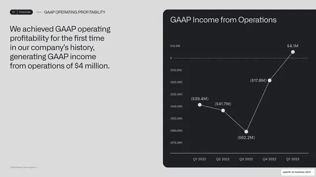
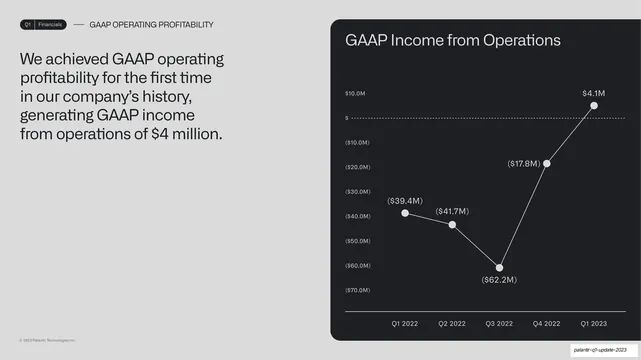
Headline-left, chart-right split: GAAP operating profitability claim left, a five-quarter income-from-operations line chart rising across zero in a dark card right.
Summary
An operating-profitability proof slide: the GAAP operating income claim on the left, a five-quarter income-from-operations line chart that climbs across zero on the right.
Visual description
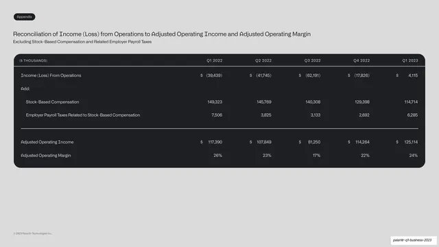
A light grey slide repeating the prior layout. Running header reads "Q1 | Financials" and "GAAP OPERATING PROFITABILITY". The left holds a multi-line dark headline about achieving GAAP operating profitability for the first time and generating roughly $4 million in income from operations. The right is a rounded near-black card titled "GAAP Income from Operations". A white line chart plots Q1 2022 to Q1 2023 with white nodes and value labels (($39.4M), ($41.7M), ($62.2M), ($17.8M), $4.1M); a dotted zero line marks the breakeven crossing as the trend rises into positive territory.
Key takeaway
The same headline-plus-dark-chart-card template applied again, building consistency across consecutive financial slides. Negative values shown in parentheses with the dotted zero line make the turn to profit unmistakable.
Reuse notes
A direct repeat of the metric-trend pattern; reuse it across a series of related KPIs so the deck reads as one system. Keep value labels close to nodes and the zero line dotted for any breakeven story. Best when several charts share the same axis treatment.
From this deck: GAAP income from operations line chart
View deck




More like this






Keep what you find
A free account saves references to boards and can send you a weekly email of picks based on what you save.
To see every result, go Pro.