Preview image. Unlock full-res
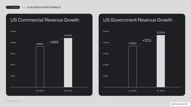
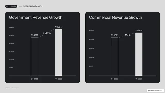
Two side-by-side dark chart cards comparing US Commercial and US Government revenue growth, each a two-bar year-over-year chart with a dotted percent callout.
Summary
A two-up comparison: side-by-side dark chart cards for US Commercial Revenue Growth and US Government Revenue Growth, each a two-bar year-over-year chart with a dotted percent callout.
Visual description
A light grey slide. Running header reads "Q1 | Financials" and "US BUSINESS PERFORMANCE". Two equal rounded near-black cards sit side by side. Left card, "US Commercial Revenue Growth", plots Q1 2022 ($85M, outlined) to Q1 2023 ($107M, solid) with a dotted "+26%" callout. Right card, "US Government Revenue Growth", plots Q1 2022 ($188M) to Q1 2023 ($230M) with a dotted "+22%" callout. Both use white bars, monospace y-axis labels, and matching internal scale treatment.
Key takeaway
Pairing two of the same chart card side by side to compare two segments at once, identical construction making the two figures directly legible against each other. Reusing the outlined-vs-solid bar pair and dotted percent callout keeps the system consistent.
Reuse notes
A clean two-up for comparing two related metrics or segments on one slide. Keep both cards on the same visual scale logic even when axes differ so the comparison feels fair. The pattern recurs across the next several slides, building a recognizable rhythm.
From this deck: US commercial and government revenue two-up
View deck





More like this





Keep what you find
A free account saves references to boards and can send you a weekly email of picks based on what you save.
To see every result, go Pro.