DocuSign Brand Identity Guidelines 2024
A 102-page DocuSign brand identity system built on a Cobalt blue-violet base, the geometric Nexus icon, the custom DS Indigo typeface, and warm gradient and line-art motifs.
102 slides · Guideline
View deck overview
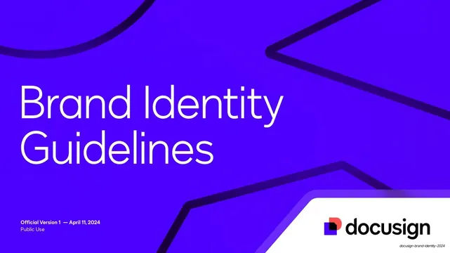
DocuSign Brand Identity Guidelines cover

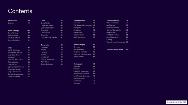
Contents table

Introduction section opener

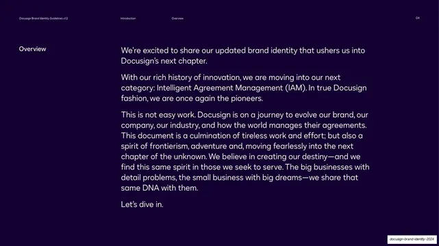
Overview intro copy

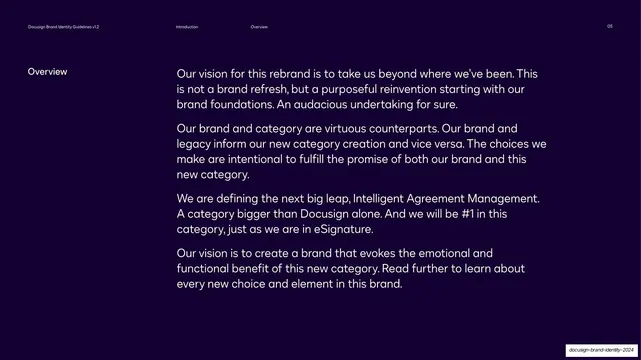
Overview vision copy

Brand Strategy section opener

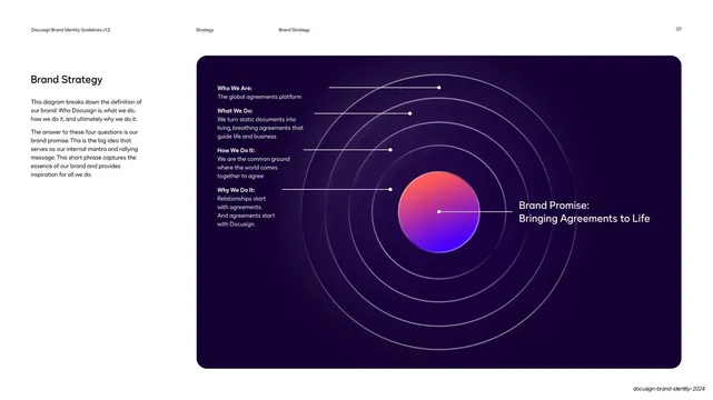
Brand Strategy radial diagram

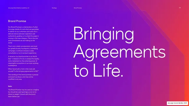
Brand Promise hero statement

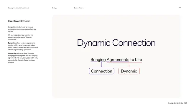
Creative Platform breakdown

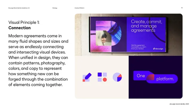
Visual Principle 1 Connection

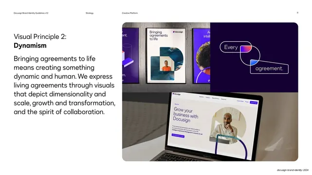
Visual Principle 2 Dynamism

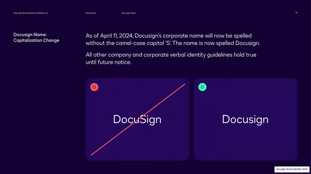
Docusign name capitalization do and dont

Logo section opener

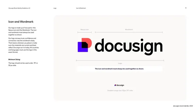
Icon and Wordmark anatomy

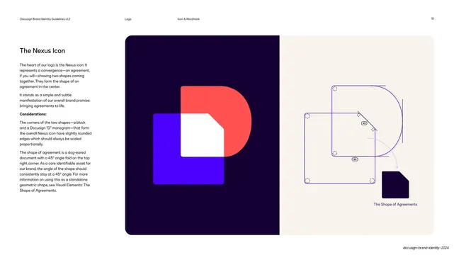
The Nexus Icon construction

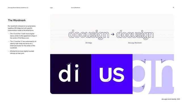
DocuSign wordmark construction

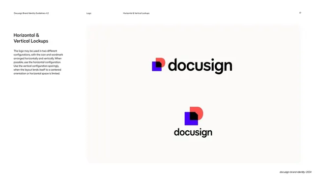
DocuSign horizontal and vertical lockups

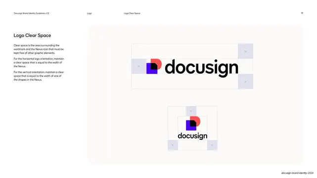
DocuSign logo clear space

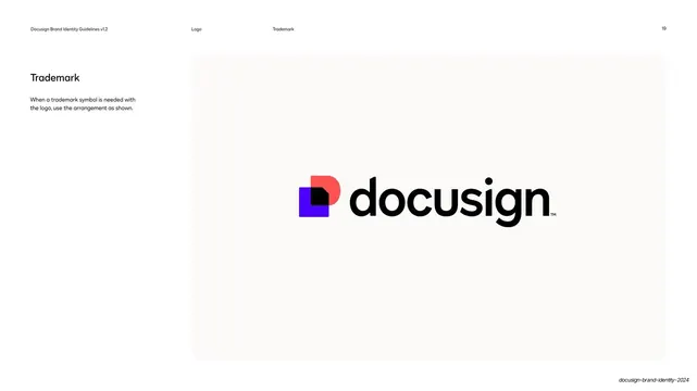
DocuSign trademark placement

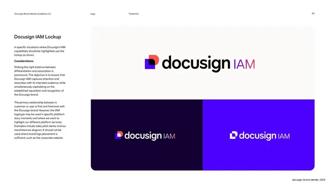
DocuSign IAM lockup

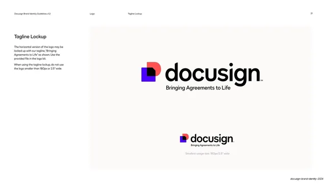
DocuSign tagline lockup

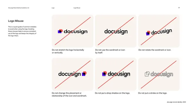
DocuSign logo misuse grid

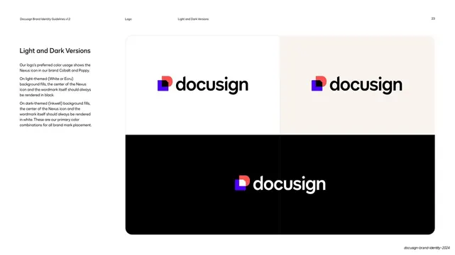
DocuSign light and dark logo versions

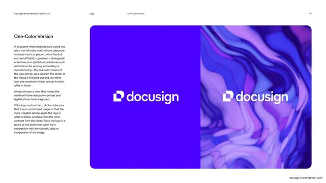
DocuSign one-color logo version

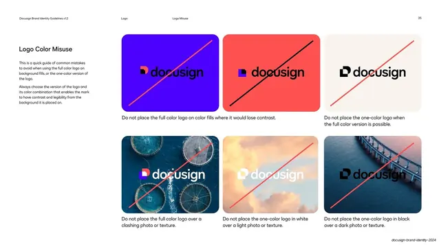
DocuSign logo color misuse grid

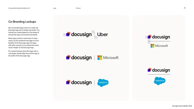
DocuSign co-branding lockups

DocuSign brand name usage do and don't

DocuSign Color section divider

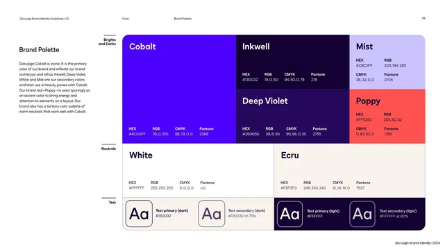
DocuSign brand palette swatches

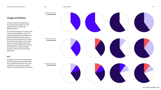
DocuSign color usage and ratios

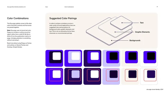
DocuSign suggested color pairings

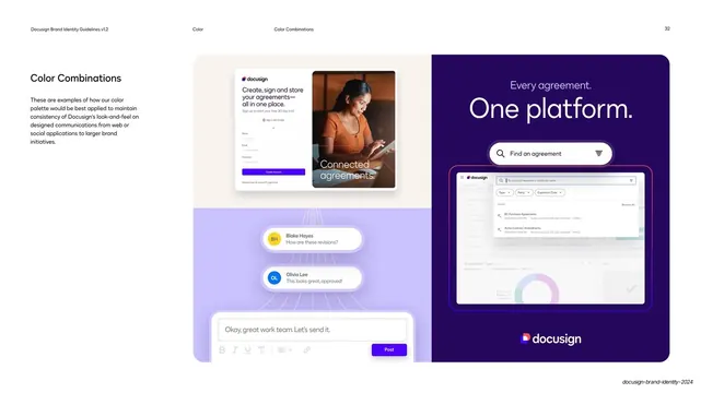
DocuSign color in web and social application

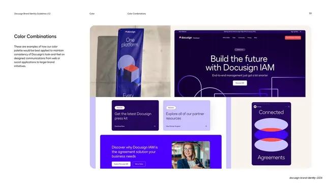
DocuSign color in banners and social

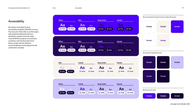
Accessibility color-pairing pass/fail matrix

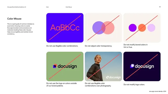
Color misuse do-not grid

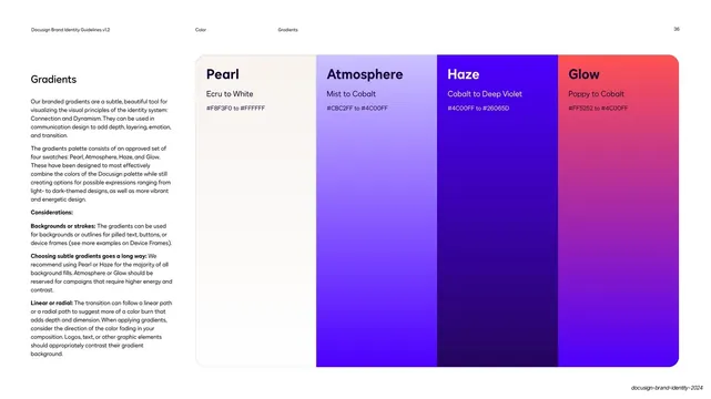
Approved gradients spec panel

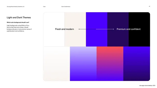
Light and dark themes spectrum

Typography chapter divider with letterform blueprint

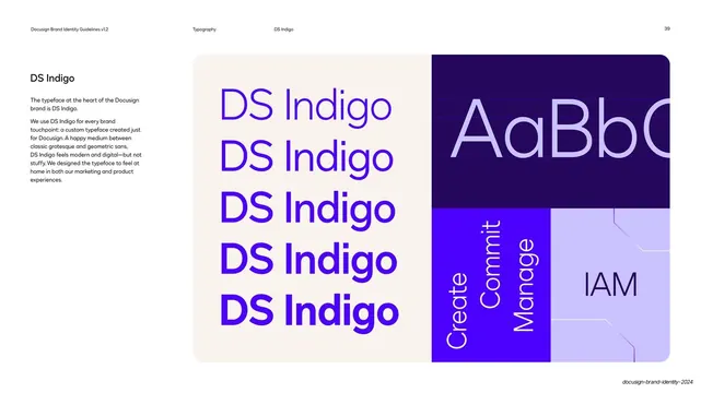
DS Indigo typeface introduction

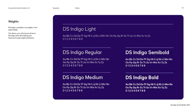
DS Indigo six-weight specimen

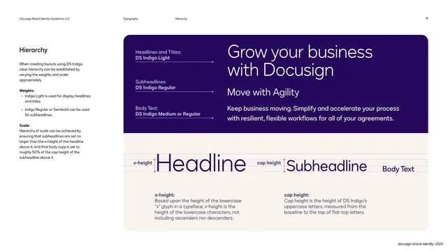
Type hierarchy headline-subhead-body demo

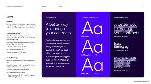
Type styling alignment tracking leading panel

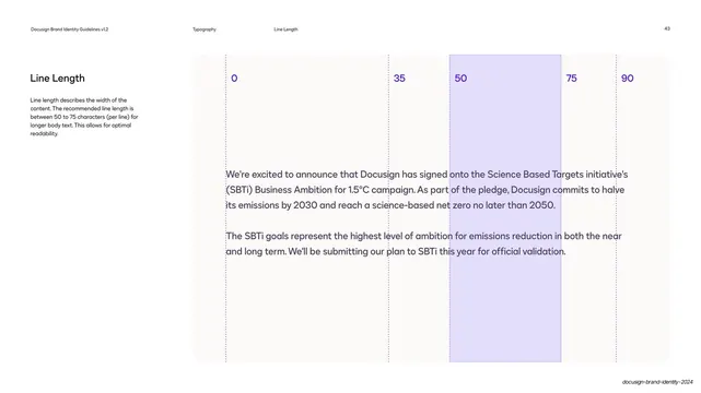
Line length character-count ruler

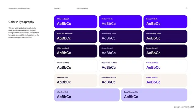
Color in typography pairing grid

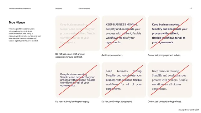
Type misuse do-not grid

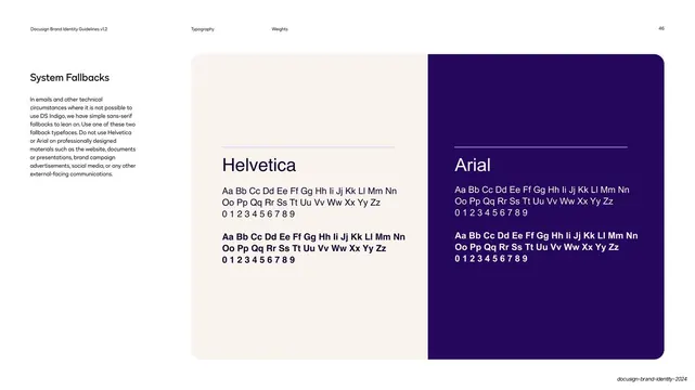
System fallback typefaces Helvetica and Arial

Visual Elements chapter divider with isometric diamonds

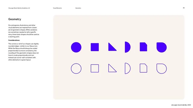
Core geometry shape set solid and outline

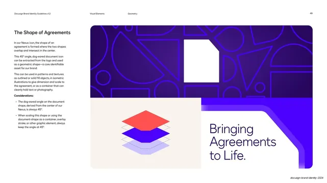
The Shape of Agreements document motif

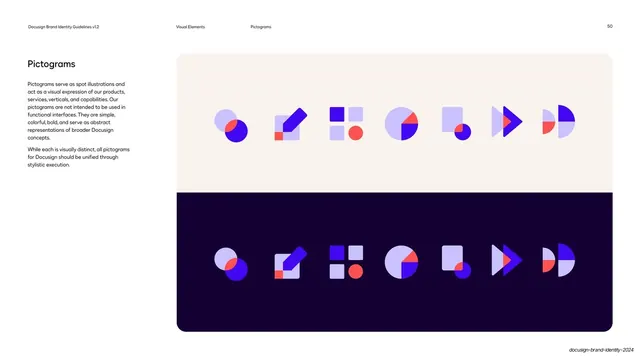
Pictograms set on light and dark

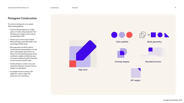
Pictogram construction rules

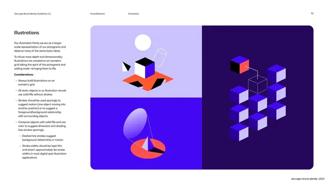
Illustrations isometric grid guidance

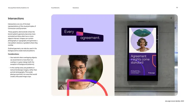
Intersections geometry guidance

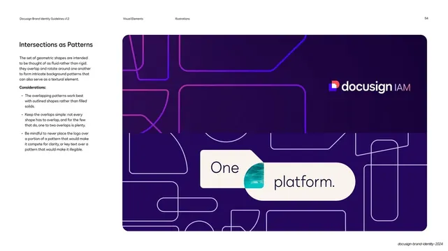
Intersections as patterns

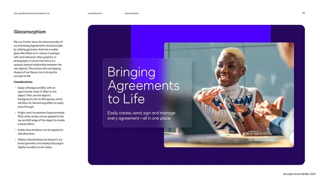
Glassmorphism overlap guidance

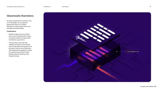
Glassmorphic illustrations guidance

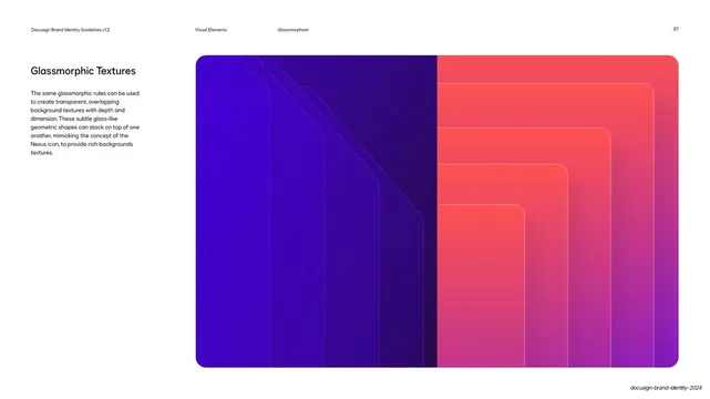
Glassmorphic textures guidance

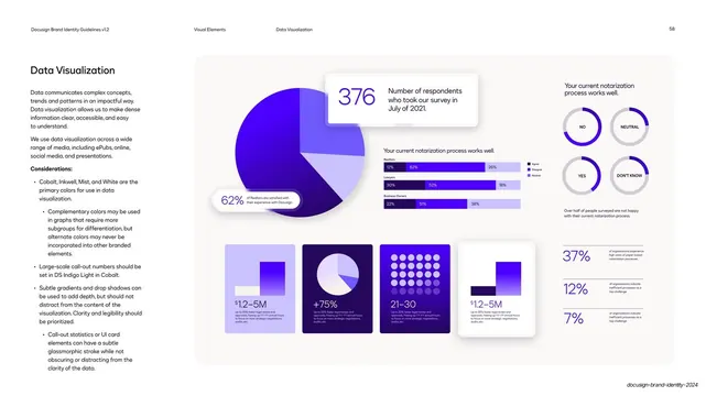
Data visualization guidance

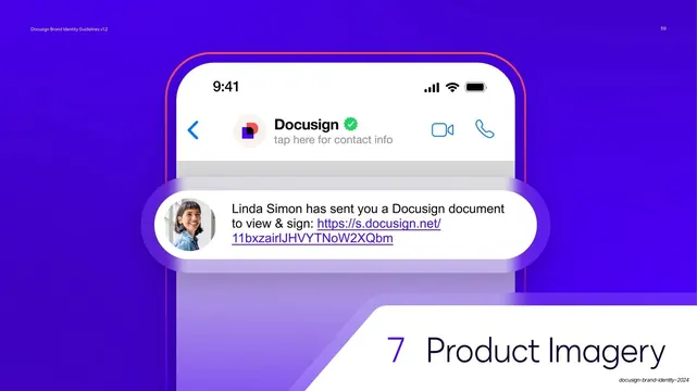
Product Imagery section divider

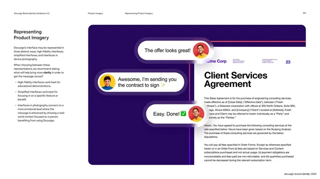
Representing product imagery three ways

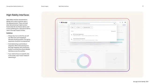
High-fidelity interfaces guidance

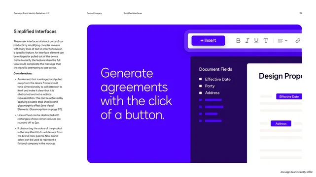
Simplified interfaces guidance

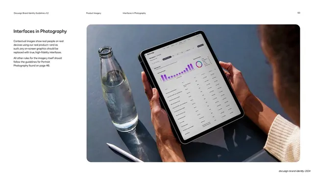
Interfaces in photography guidance

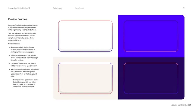
Device frames guidance

Photography section divider

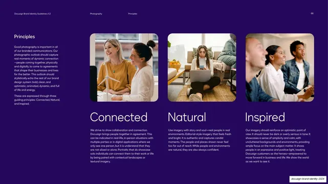
Photography principles three columns

Portrait photography guidance

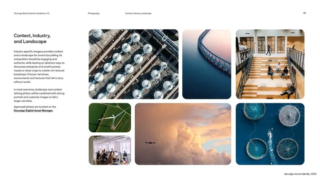
Context industry and landscape photography

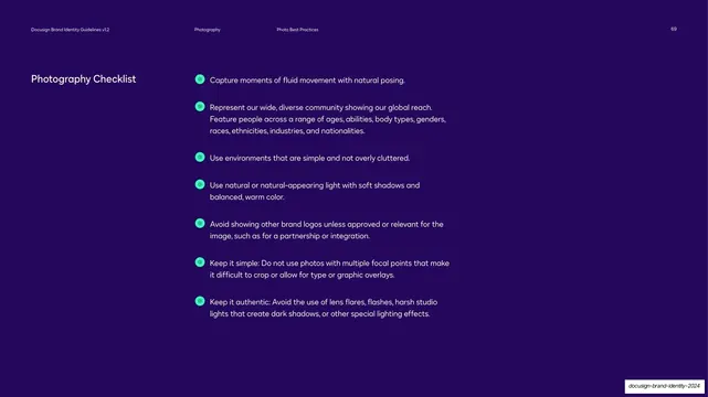
Photography checklist

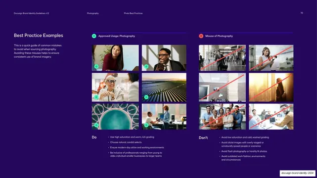
Photography do and don't best-practice grid

Post-production grading don't example

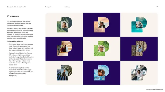
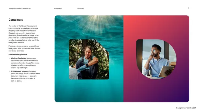
Nexus photo-mask container grid

Document-mask containers on full-bleed fields

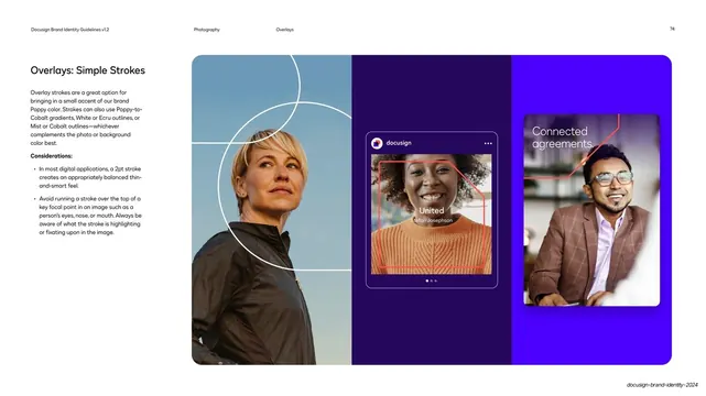
Simple stroke overlays on photography

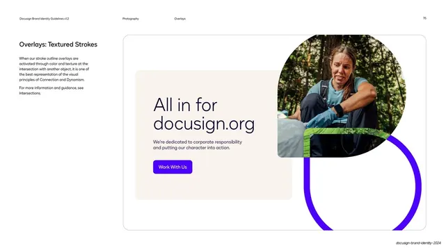
Textured stroke overlay campaign example

Video/Motion chapter divider

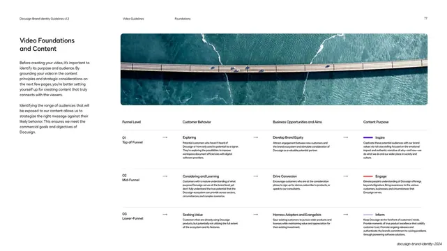
Video foundations funnel matrix

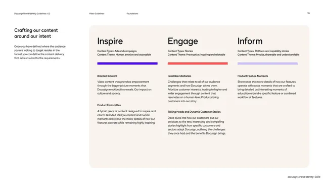
Inspire / Engage / Inform content columns

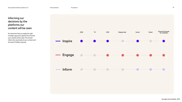
Content modes by platform dot matrix

Video art direction photo grid

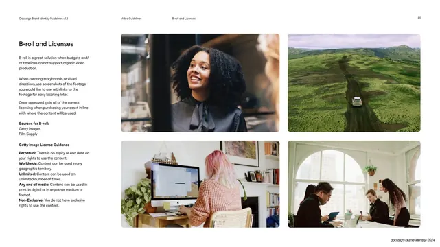
B-roll and licensing reference page

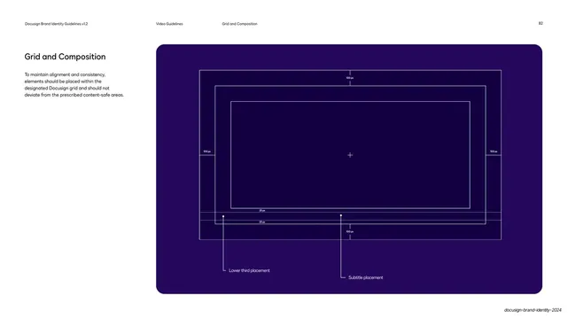
Video grid and composition safe-area spec

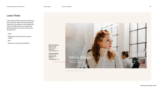
Lower thirds spec example

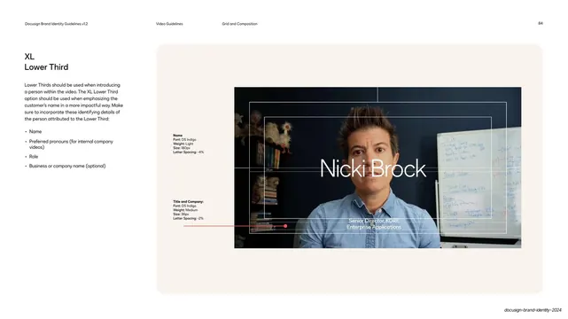
XL lower third spec example

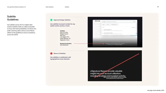
Subtitle guidelines do and don't

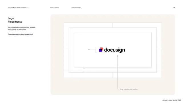
Logo placement in video spec

Inclusive casting photo page

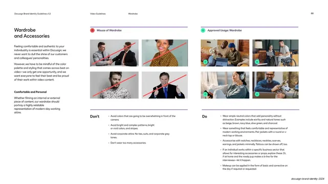
Wardrobe and accessories do and don't

Appendix Brand in Use section divider

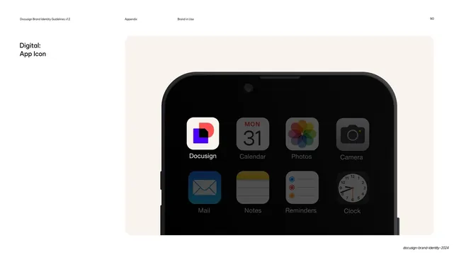
App icon on mobile home screen mockup

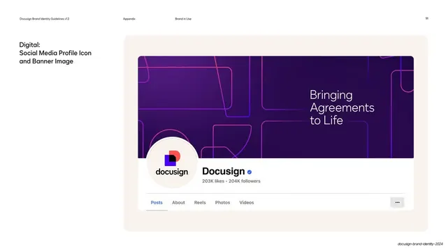
Social profile icon and banner mockup

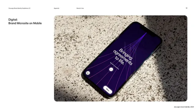
Brand microsite on mobile mockup

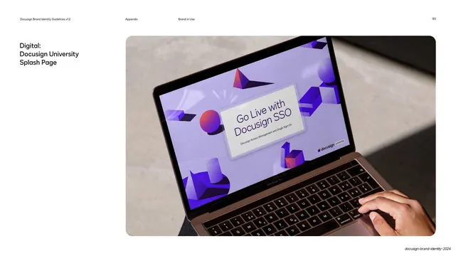
Docusign University splash page mockup

IAM landing page on laptop mockup

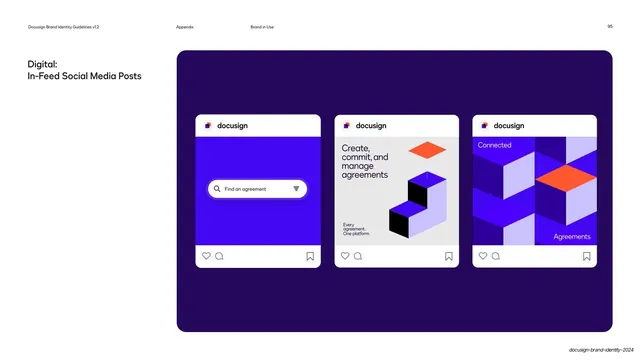
In-feed social media post templates

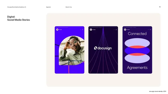
Social media story templates

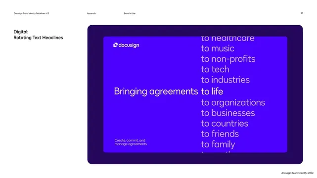
Rotating text headline treatment

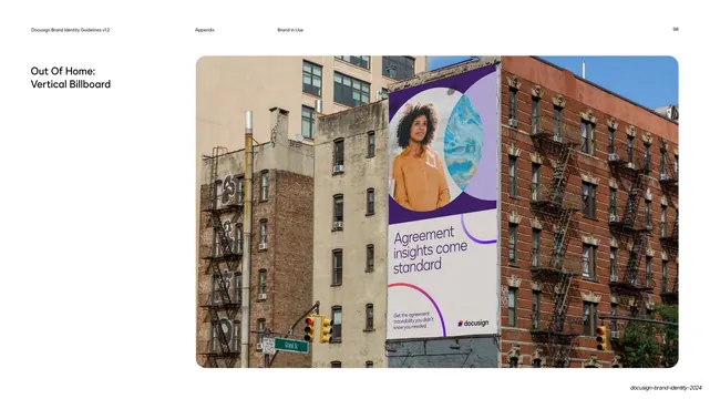
Out-of-home vertical billboard mockup

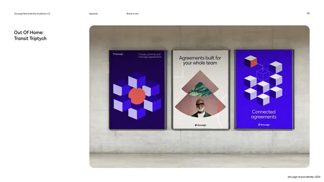
Out-of-home transit triptych mockup

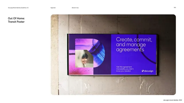
Out Of Home transit poster mockup

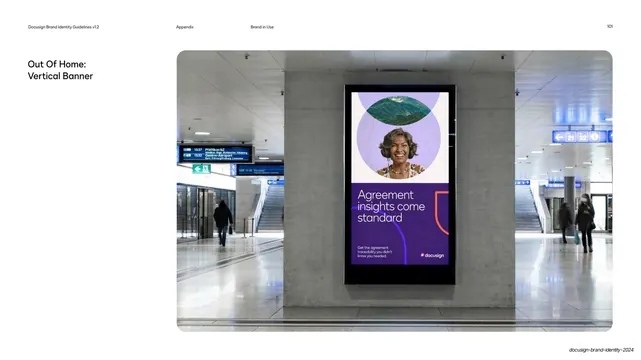
Out Of Home vertical banner mockup

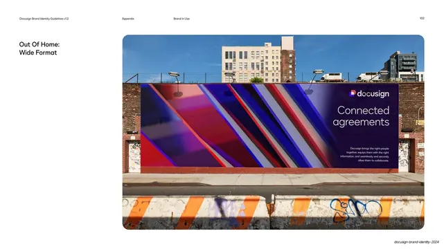
Out Of Home wide-format mural mockup