Preview image. Unlock full-res
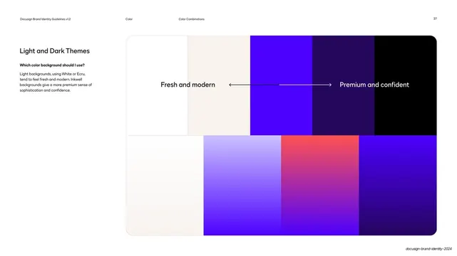
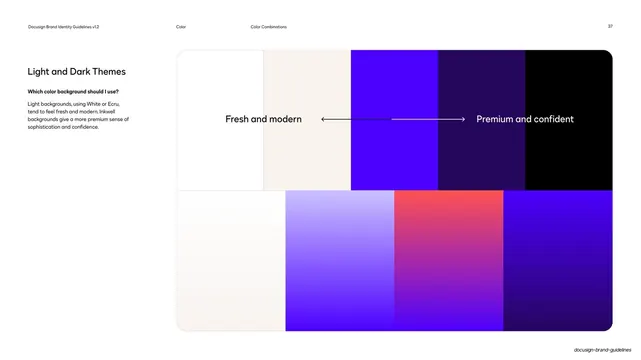
A light-to-dark color spectrum panel with a double-headed arrow between "Fresh and modern" and "Premium and confident" mapping background mood to value.
Summary
A page that maps background choice to brand mood, laying out a continuous color spectrum from light cream to near-black with a labeled arrow from "Fresh and modern" to "Premium and confident".
Visual description
Standard guideline layout on white. The left column holds the heading "Light and Dark Themes", a bold question "Which color background should I use?", and a short paragraph. The right side is a wide rounded panel split into two rows of horizontal color fields running left to right from white and cream into cobalt, deep violet, and black, with gradient versions in the lower row (including a poppy-to-violet band). Across the upper row, centered white and dark text reads "Fresh and modern" on the left and "Premium and confident" on the right, joined by a thin double-headed horizontal arrow. Running header: "Color / Color Combinations / 37".
Key takeaway
Plotting brand value (light to dark) against perceived mood on a single horizontal axis gives designers an intuitive rule for picking backgrounds without a long table. The double-headed arrow communicates a spectrum, not two fixed options.
Reuse notes
A neat way to express theme philosophy in a brand guide. Reuse the mood-on-a-spectrum diagram whenever a system supports both light and dark and you want to guide tone. Keep the endpoint labels short and evocative.
From this deck: Light and dark themes spectrum
View deck


















More like this






Keep what you find
A free account saves references to boards and can send you a weekly email of picks based on what you save.
To see every result, go Pro.