Preview image. Unlock full-res
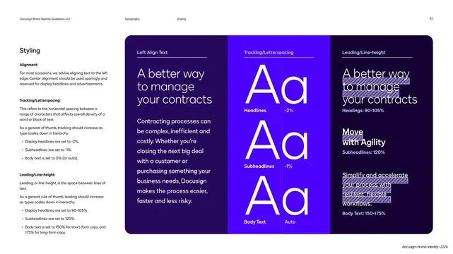
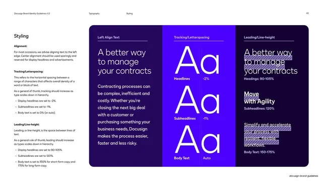
A three-column deep-violet demo of type styling rules, left alignment with body copy, tracking shown by giant Aa with percentages, and leading shown by stacked highlighted lines.
Summary
A styling-rules page split into three deep-violet columns demonstrating alignment, tracking/letterspacing, and leading/line-height, each with a worked visual example.
Visual description
Standard guideline layout on white. The left column holds "Styling" and three labeled rule blocks (Alignment; Tracking/Letterspacing; Leading/Line-height) with bullet specifics. The right is one rounded deep-violet panel divided into three vertical columns, each headed by a small white label over a hairline rule. Left column "Left Align Text" shows a large left-aligned headline and a flush-left body paragraph in white. Center column "Tracking/Letterspacing" stacks three giant white "Aa" pairs labeled Headlines -2%, Subheadlines -1%, Body Text Auto. Right column "Leading/Line-height" repeats the headline/subhead/body text with lavender highlight bars marking line spacing, labeled Headings 90-105%, Subheadlines 120%, Body Text 150-175%. Running header: "Typography / Styling / 42".
Key takeaway
Demonstrating three separate type-styling parameters in parallel columns, each with a concrete numeric value attached to a visible example, turns invisible micro-typography rules into something you can see and copy. The oversized "Aa" pairs make tracking legible at a glance.
Reuse notes
A thorough styling-rules template for a type system in any brand guide. The parallel-column "rule plus value plus example" layout is reusable for other micro-typography specs. Dark panel keeps the highlighted leading bars readable; ensure values match the rest of the system.
From this deck: Type styling alignment tracking leading panel
View deck









More like this



Keep what you find
A free account saves references to boards and can send you a weekly email of picks based on what you save.
To see every result, go Pro.