Preview image. Unlock full-res
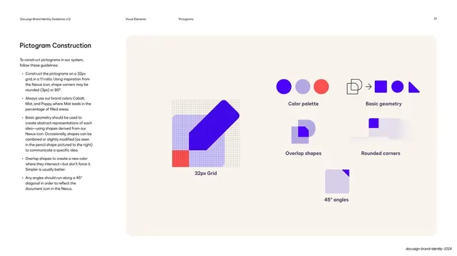
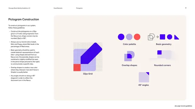
A pictogram-construction page pairing a bulleted rule list with five labeled demos, a 32px grid pencil, color palette, basic geometry, overlap shapes, rounded corners, and 45-degree angles.
Summary
A how-to page for building pictograms: a left rule list paired with a panel of small labeled demos, anchored by a pencil shape mapped onto a 32px grid.
Visual description
Standard guideline layout on white. The left column holds "Pictogram Construction" and a bulleted rule list (32px grid at 1:1, brand colors with Mist leading, basic geometry from the Nexus, overlap shapes for new colors, angles on a 45-degree diagonal). The right is a large rounded cream panel arranged as a small bento of labeled studies: a big "32px Grid" demo showing a cobalt pencil built on a fine grid with a poppy and lavender base; then smaller paired demos, "Color palette" (cobalt, lavender, poppy dots), "Basic geometry" (Nexus to square/circle/triangle), "Overlap shapes" (a layered document mark), "Rounded corners", and "45 angles" (a lavender square with a violet dog-ear). Running header: "Visual Elements / Pictograms / 51".
Key takeaway
Splitting construction into one short rule per labeled mini-demo turns an icon-building process into a checklist you can follow. Showing the underlying 32px grid on a finished pictogram makes the abstract sizing rule concrete.
Reuse notes
A practical companion to a pictogram showcase page, this is the "how it is made" reference. The rule-plus-mini-demo bento is reusable for documenting any construction system (icons, illustrations, patterns). Pair it with the family showcase so designers see both the output and the method.
From this deck: Pictogram construction rules
View deck






































More like this

Keep what you find
A free account saves references to boards and can send you a weekly email of picks based on what you save.
To see every result, go Pro.