Preview image. Unlock full-res
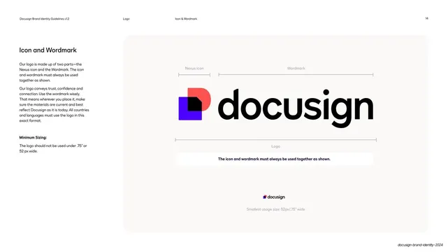
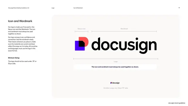
Light spec page pairing left rules with a soft panel that labels the logo's two parts (Nexus icon and Wordmark) with measure brackets and a minimum-size example.
Summary
The logo anatomy page: left-column rules beside a soft panel that breaks the logo into its Nexus icon and Wordmark with measure brackets, plus a small minimum-size example.
Visual description
White page. The left column carries a bold "Icon and Wordmark" head, two paragraphs on always using the parts together, and a bold "Minimum Sizing:" note (no smaller than .75 inch / 52px). The right two-thirds is a large soft off-white rounded panel showing the full color logo at center, the Nexus icon (violet block plus coral half-circle plus white dog-eared center) beside the black lowercase "docusign" wordmark. Thin measure brackets above label "Nexus icon" and "Wordmark", and a bracket below labels the whole "Logo". A small caption bar restates the rule, and a tiny logo at bottom demonstrates the minimum size. The running header reads Logo / Icon & Wordmark.
Key takeaway
The measure-bracket anatomy diagram naming each logo component, paired with an in-context minimum-size example on the same page. It documents structure and scale together inside one calm panel.
Reuse notes
A standard, highly reusable logo-spec layout for any brand guidelines deck. The soft panel isolates the mark; measure brackets read as technical without clutter. Swap in your own lockup and minimum dimensions.
From this deck: Icon and Wordmark anatomy
View deck

























More like this



Keep what you find
A free account saves references to boards and can send you a weekly email of picks based on what you save.
To see every result, go Pro.