Preview image. Unlock full-res
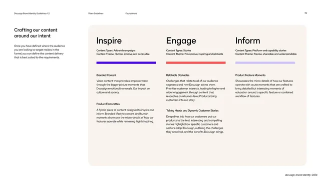
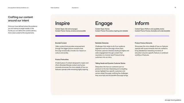
A light page laying out three content modes (Inspire, Engage, Inform) as parallel columns, each headed by an oversized label, a colored accent bar, and stacked content-type descriptions.
Summary
A content-strategy page presenting three modes side by side: Inspire, Engage, and Inform, each a column with an oversized heading, a short colored accent bar, and stacked content-type definitions.
Visual description
White page, standard header. The left column holds the title "Crafting our content around our intent" and a short intro paragraph. The right two-thirds is a large cream rounded panel split into three equal columns. Each column opens with an oversized near-black heading (Inspire, Engage, Inform), followed by two small "Content Types" and "Content Theme" lines, then a full-width accent bar in the column's brand color (violet, coral-red, light-violet). Below the bar each column lists two or three bold subheads with paragraphs describing content formats.
Key takeaway
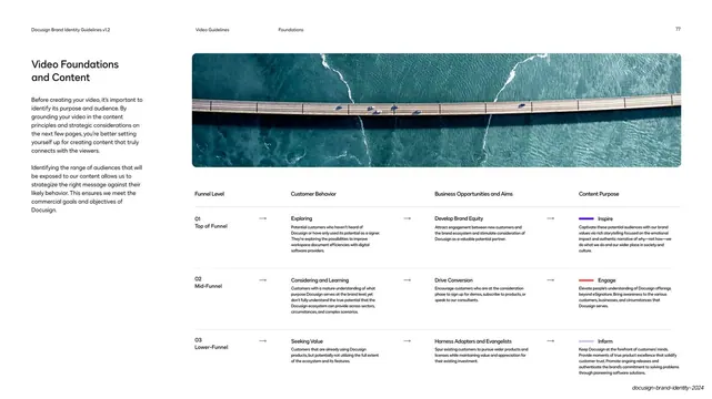
The clean three-up comparison: identical column structure, one oversized label each, and a single colored accent bar that codes each mode in the brand palette. Reusing the same violet/red/light-violet keys established on the prior funnel page ties the system together.
Reuse notes
A versatile layout for comparing three pillars, tiers, or modes with equal weight. The accent bar is a low-effort way to color-code without heavy backgrounds. Keep the three columns structurally identical so differences read as content, not layout.
From this deck: Inspire / Engage / Inform content columns
View deck






More like this
Keep what you find
A free account saves references to boards and can send you a weekly email of picks based on what you save.
To see every result, go Pro.