
Preview image. Unlock full-res
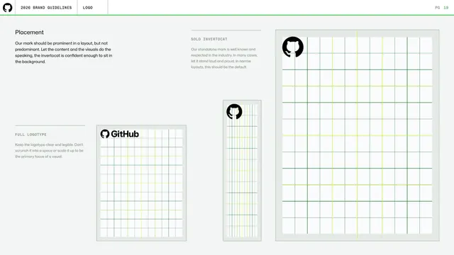
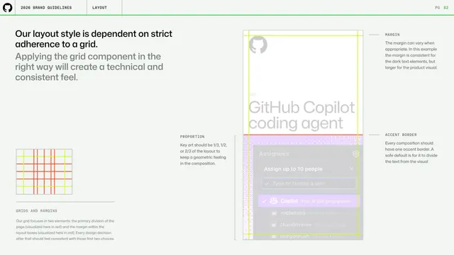
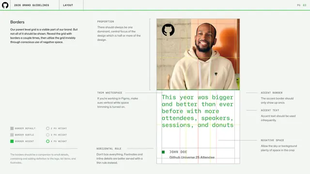
Light page on logo placement, showing the full logotype, solo Invertocat, and a narrow-format variant positioned on gridded layout mockups.
Summary
A logo-placement page demonstrating where the mark should sit within layouts, using three gridded mockups for the full logotype, the solo Invertocat, and a narrow format.
Visual description
Light grey background. A "Placement" heading and grey copy at top-left explain the mark should be prominent but not predominant. Three labeled examples (FULL LOGOTYPE, SOLO INVERTOCAT, and a tall narrow variant) each show a light card overlaid with a faint green column grid and the relevant logo tucked into a corner. Yellow-green guide lines indicate margins and alignment within the grid.
Key takeaway
Showing logo placement against an actual column grid rather than in isolation, including a narrow/vertical format where the solo mark becomes the default. The "prominent but not predominant" principle is a useful framing.
Reuse notes
Good reference for documenting in-layout logo positioning across aspect ratios. The grid overlays make the placement rules feel system-level rather than case-by-case.
From this deck: Logo placement and grids
View deck



















More like this

Keep what you find
A free account saves references to boards and can send you a weekly email of picks based on what you save.
To see every result, go Pro.