Preview image. Unlock full-res
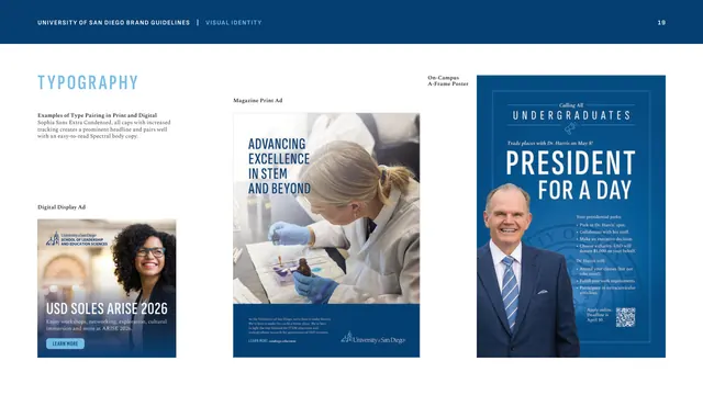
Three applied layouts, a digital display ad, a magazine ad and an A-frame poster, showing the condensed-sans headline plus serif body pairing in use.
Summary
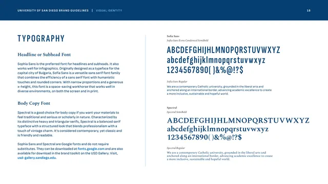
A typography examples page showing the Sophia Sans condensed headline and Spectral body pairing applied across three real formats: a digital display ad, a magazine print ad, and an on-campus A-frame poster.
Visual description
A short left caption ("Examples of Type Pairing in Print and Digital") notes that Sophia Sans Extra Condensed all-caps with increased tracking makes a prominent headline that pairs with Spectral body. The rest of the page is three vertical ad mockups. A "Digital Display Ad" shows a smiling person over a photo with "USD SOLES ARISE 2026" in condensed caps and a small rounded "LEARN MORE" button. A taller "Magazine Print Ad" places "ADVANCING EXCELLENCE IN STEM AND BEYOND" in blue condensed caps beside a lab photo, over a blue footer with the master logo. An "On-Campus A-Frame Poster" in Founders Blue reads "PRESIDENT FOR A DAY" in big white condensed caps above a photo of the president and a QR code.
Key takeaway
Demonstrating the headline-plus-body pairing across three channels at once proves the system travels from a small display ad to a full poster. The recurring move, oversized tracked condensed caps over a strong photo, with Spectral handling the fine print, is the brand's most repeatable layout idiom.
Reuse notes
Reach for this when a type page needs to show range rather than just specimens. The big-condensed-caps headline treatment is a strong, economical look for event, recruitment, and campaign collateral. Pairs with the typography specimen page and the color-usage examples.
From this deck: Type-pairing examples across print and digital
View deck

More like this




Keep what you find
A free account saves references to boards and can send you a weekly email of picks based on what you save.
To see every result, go Pro.