Preview image. Unlock full-res
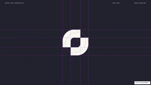
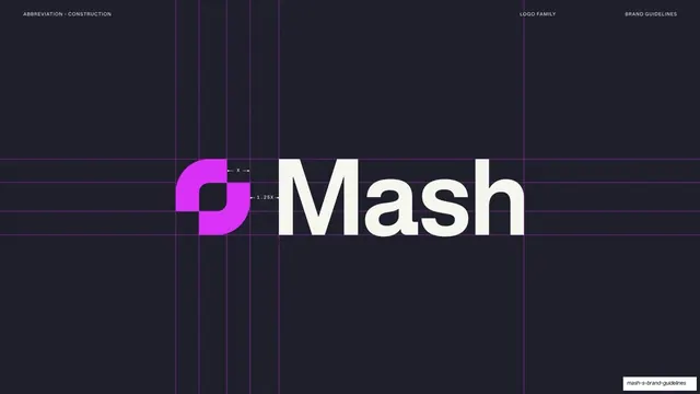
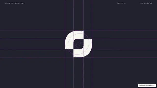
Dark slide showing the Mash graphic mark centered over a magenta dotted construction grid of crosshairs and circles.
Summary
The graphic-mark construction page: the cream Mash mark sits dead-center on a dark field, overlaid with a magenta dotted grid of crosshair lines and concentric circles showing its geometry.
Visual description
Near-black navy-charcoal background. The interlocking graphic mark is rendered large and centered in cream. Behind and across it runs a construction system in fine magenta dotted lines: vertical and horizontal crosshair guides extending to the page edges, plus concentric circles and arcs that define the mark's rounded corners and counter. A mono header sits at top: "GRAPHIC MARK CONSTRUCTION" upper-left, "LOGO FAMILY" / "BRAND GUIDELINES" upper-right.
Key takeaway
Using the brand accent color for the construction guides themselves, so the geometry layer feels on-brand rather than like generic redlines. Centering the mark large with crosshairs running to the edges communicates "built on a grid" instantly.
Reuse notes
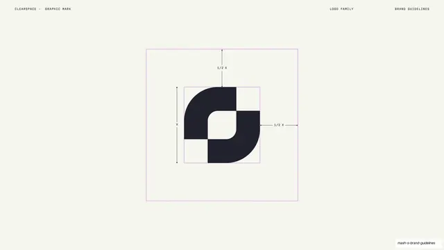
A standard logo-construction page for any brand book; the move worth borrowing is coloring the dotted guides in the brand accent. Requires a clean vector mark and accurate geometry to be credible. Best on a dark field where light-colored guides and mark read clearly.
From this deck: Graphic mark construction grid
View deck







































More like this






Keep what you find
A free account saves references to boards and can send you a weekly email of picks based on what you save.
To see every result, go Pro.