Preview image. Unlock full-res
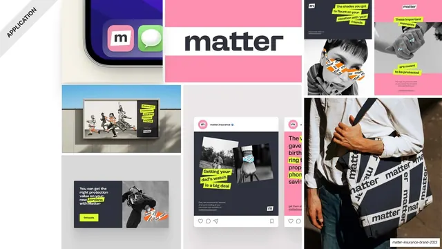
A full-bleed mosaic of brand applications, app icon, billboard, social posts, wordmark blocks and a matter-tape tote, with a rotated APPLICATION corner banner.
Summary
A dense edge-to-edge grid of finished brand applications that previews the whole identity in action before the application chapter proper.
Visual description
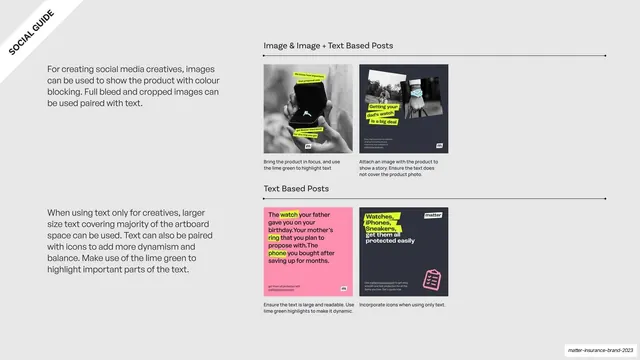
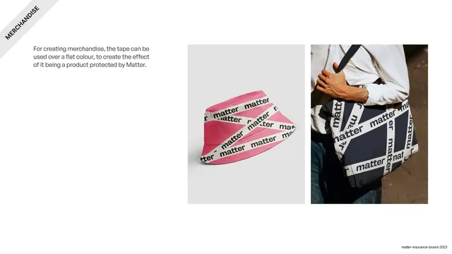
A full-bleed tiled mosaic with a small rotated "APPLICATION" banner in the top-left corner. Tiles include: a phone home screen showing the pink "m" app icon next to Messages; a pink block holding the dark "matter" wordmark; a billboard photo with a tape-wrapped silhouette; black-and-white social cards on pink and dark backgrounds with lime text highlights and orange matter-tape graphics; a "Get quote" web banner; and a photograph of a navy tote bag printed with crisscrossed white "matter" tape. Colors jump between hot pink, navy, lime and orange across the grid.
Key takeaway
Opening an application chapter with one packed collage that shows the system surviving across app, OOH, social, web and merch at once. It sells cohesion through variety rather than a single hero mockup.
Reuse notes
A strong "brand in the wild" divider or summary for an identity deck. Needs enough real or convincing mockups to fill the grid without looking sparse. The crisscross-tape merch is the signature motif worth carrying through.