Preview image. Unlock full-res
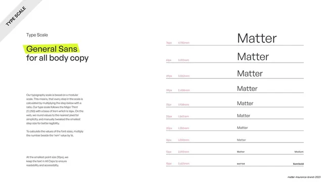
Type-scale page for General Sans body copy showing "Matter" stepping down a modular scale with px and rem labels.
Summary
The General Sans type scale: the word "Matter" repeated down a modular ladder from 76px to 10px for body copy, each step tagged with px and rem, with the typeface name highlighted in neon green.
Visual description
A white full-bleed slide with a rotated "TYPE SCALE" ribbon in the top-left corner, mirroring the Roc Grotesk page. The left column reads "Type Scale" then a headline "General Sans for all body copy", with "General Sans" on a neon-green highlighter block; below it the same modular-scale explanation (Major Third, 16px base) plus a note that the smallest 10px size is set in all caps for legibility. The right two-thirds is the specimen ladder: "Matter" in General Sans descending from 76px to 10px, each row above a thin rule, with pink px/rem labels (76px / 4.750rem down to 10px / 0.625rem) and weight notes ("Medium", "Semibold") at the smallest steps; the final 10px row is set in all caps.
Key takeaway
Giving the body typeface its own scale page that mirrors the headline one exactly, including the legibility carve-out (all caps at 10px). Consistency between the two type-scale pages makes the system feel rigorous and complete.
Reuse notes
The body-copy half of a two-page type-scale spec, reusable for any design system. Documenting weight shifts and a small-size legibility rule is the transferable detail. Keep it visually identical to the heading-scale page so they read as a pair.
From this deck: General Sans type scale
View deck















More like this








Keep what you find
A free account saves references to boards and can send you a weekly email of picks based on what you save.
To see every result, go Pro.